
For the publication design i am wanting to have a mix of type and image within the publications. I have created my own grid and working with a 3 column system which i will use across all three publications so that they are all consistent with each other, but here is some inspiration to help me inform myself on the design style that i want to use.

Good use of imagery within the full bleed image. Black and white imagery works well on here because it gives it that feel of old and tired, which is also tied in with the colour of the stock used. Layout of the spread works well, not too much body copy, images illustrate what the body copy is saying.

Like the colour of the spread and the minimalistic look to the design. The imagery works well within the body copy and breaks this up a little making it easier to read.

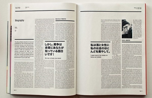
Although this spread is only body copy and type it is interesting to look at and to read because of the different type and point sizes used within the design. The design i broken down because of the different sizes used. nice colour of stock used too.
Black and white throughout, this makes it a little boring, could of done with some colour to make it more interesting and to stand out more. Like the type on the left hand side. Not too use on the layout of the right hand side, looks like everything is out of line and not meant to be? not thought out well.

Good mix of imagery and body copy. Like the use of the green within the imagery and this stands out within the page design. Maybe takes away too much from the body copy? Layout of the page is not standard, but makes it more interesting to look at and to read because of this.

Good use of full bleed imagery although the title and body copy is hard to read as its in white over a pastel colour so doesnt stand out that well. The page next to it is laid out well within the two columns but could of been more interesting within the design to make it more aesthetically pleasing.

Nice use of splitting the page to be able to use a full bleed image on one half, but the copy on the other page is very boring and there is too much within the given space, with not a lot of white space around it, so this makes it seem as though there is more body copy and hard to read.

Love the colour used throughout the spread. The colour overlay works well on the imagery and makes the page more interesting and brighter to look at because of the colour. Body copy works well over the coloured page.

Great use of image and text together in the layout. The body copy is broken down by the use of the images and makes it easier to read and has less body copy because of the images. Titles and heading are placed well and in larger point sizes so easy to identify and read.

Great use of columns and grid within the page, this makes the design and readability of the page a lot better. The structure also helps you read through the body copy and makes it seem there is less body copy within the page itself.

Nice use of colour within the heading of the page. This is continued throughout the page design and used to break up the body copy within the page layout. The colour makes it more interesting and adds extra brightness to the page to make it less boring.
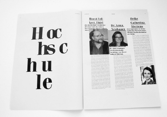
I like the 3 column structure used within the design and as it shows here it can be adapted to work for the different content on each page. Use of the bigger heading within the body copy work well and breaks up the page which would normally be heavy on body copy. Use of line separators and the heading of the page works well together.
These images show a good balance of type and image within the layout, there is a clear grid structure which provides a good, clear and legible layout within the publications. This sort of style it they way in which i am going to design my publications, but as i said before i have my own grid and using the 3 column system so the design will take on its own aesthetics as i dont want to copy something that is already out there and being done.
No comments:
Post a Comment