
For the branding of my exhibition i want to create a product range like the ones in the image below. I think this is something that is important because it shows how the brand and identity can be spread across a wide range of products, those which are all different formats and ave the branding applied in different ways but when its all together in one place it looks like one set of branding work.
This is something that i hope to achieve with my own work, i am going to have the branding products, but i may add a few items into the images to show other things such as pens, books, clips just to add to the image to build out this whole idea of what the brand could accumulate to be.

Love the bright colours within the branding, makes it very eye catching. The pattern and idea of the colours has been spread across the full branding material and adapted for each format. Photography of it all is great too.

Colours used for the stock and patterns are nice, they all fit together and compliment each other well. Lots of different formats used to show how the logo and identity can be carried across the full branding set.

Like the tartan style pattern and the colour used. This has a much more professional feel to it by the use of business envelopes and well structured and laid out compliment slip and letterhead. The injection of colour within some of the products bring it all to life and make it a lot more interesting.

Love the yellow accent colour used. Works well with the grey and black also used within the branding. Again another corporate identity i think as it is very well designed, with everything aligned and laid out to a strict grid. Has a modernist feel towards it.

Again i like the yellow used within the branding. This has been carried across all the branding material which looks great and makes it stand out because it is so bright. I like the the black pattern printed over the yellow. It also works well against the white stock on the letter head. Nice design to the folder.

Lovely colour scheme in a pastel colour palette, but one that is quite vibrant at the same time? Logo has been used throughout all the products and looks great. The simple white logo on the coloured product is very simple but still very effective and makes it stand out.

Love the cut through on the logo within all the products. Makes it something different. Nice coloured stock which looks like there is three different types but they all compliment each other - good way to break down the business products.

Bright and vibrant pink colour. Not too sure on the pattern used, but it has been adapted for each product well. The photography of this is great and makes the neon pink really stand out of the photo.

love the green colours used and how it is more environmental and has a recycled feel to it due to the stock. Nice imagery used on the branding material.

Loving the colour the yellow and grey work well together. The use of the wax stamp makes it very corporate but adds an extra design element within the branding. Looks great.

Another branding which has taken on the recycled feel by the use of colour and stock. The design of it is really goo also. Photography of it all is great.

Like the use of different products and material they have used within the branding. The colour works well with the black and really sets it off. The layout of the photography is good also.
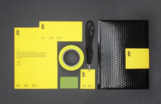
Bright yellow works a treat against the metallic black. Design of it all is very well structured and designed to a high standard, looks very professional but has a interesting look to it because of the products used - not corporate but has the design to be corporate?

The product range of this branding material is great, this shows what you can achieve with branding and how to adapt the logo and identity across a range of products. The products have been laid out well within the photography shoot, which makes it look amazing.

Nice use of foiling within the branding and makes that area shine within the photography to make it ping out of the photography. Logo has been adapted well throughout all the products. The photography and layout of shoot is great also.

Another branding that has produced a great range of products which has the identity shown on each product and adapted well for each different format. The layout and photography is also good and they have managed to get the orange really bright and to stand out of the image, catching your eye.
Using these images i have been able to identify the products which i need to create and have within my branding stationery. I think a diverse product range would be good, but also could be unrealistic with the time limit etc that we have on this brief now. I will still try to achieve something along these lines for my final images of the branding work.
The same sort of idea will be taken for the rest of the work, especially the promotional work, setting those products out in this sort of layout would be good to show the number of products that i have created for the project.
No comments:
Post a Comment