Tuesday 20 December 2011

Essay Bibliography..so far


Choosing a particular period from 1800 to the present, in what ways has art or design responded to the changing social and cultural forces of that period?

Bibliography
1. Hebdige, D (1979) ‘Subculture: The Meaning of Style’, England, Methuen and Co. Ltd.

2. Heller, S (2010) ‘Pop, How Graphic Design Shapes Popular Culture’, New York, Allworth Press.

3. Thornton, S (1995) ‘Club Cultures: Music, Media and subcultural Capital, Cambridge, Polity Press.

4. McNeill, P & Townley, C (1981) ‘Fundamentals of Sociology’, Cheltenham, Stanley Thornes Ltd.

5. The Mott Collection (2010) ‘Loud Flash: British Punk on Paper’, London, Haunch of Vension.

6. Walton, R (1997) ‘Sight for Sound, Design and Music Mixes’, New York, Hearst Books International.

7. Eskilson, S.J (2007) ‘Graphic Design: A New History’, London, Laurence King Publishing Ltd.

Essay Structure

Choosing a particular period from 1800 to the present, in what ways has art or design responded to the changing social and cultural forces of that period? ( 2 specific examples)

Introduction
- Brief introduction into essay question.
- History on subcultures in general - defining subcultures and what its all about.
- The subcultures I am looking at for the essay to lead into the actual essay.

Paragraph 1 - Pop subculture
- History behind the subculture
- How it influenced design in this period
- Link to designer and how there work reflects the design of the period

Paragraph 2 - Punk subculture

- History behind the subculture
- How it influenced design in this period
- Link to designer and how there work reflects the design of the period

Paragraph 3
- Compare both subcultures

Conclusion


Wednesday 14 December 2011

Lecture Notes//High culture vs Low culture

Objectives:
•Understand the term ‘avant-garde’
•Question the way art/design education relies on the concept
 of the avant-garde
•Understand the related concept of ‘art for art’s sake’
•Question the notion of ‘genius’
•Consider the political perspectives relating to avant-gardism
•Question the validity of the concept ‘avant-garde’ today

Dictionaries link Term – ‘avant-garde’ with terms like
innovation in the arts or pioneers.

- Idea of doing art/design work that is progressiveinnovating
- But also it refers to the idea of there being a group of people being
 innovative:
   - Being avant-garde in the work you do  - challenging,
      innovating etc.
   - Being a part of a group – being a member
     of the avant-garde.

Course definitions
Visual Communications
‘The second level aims to let you experiment within you chosen range of disciplines
 ‘Our aim is to encourage students to take a radical approach to communication’
 To be a student on the course you need to enjoy: ‘Challenging conventions’

Printed Textiles & Surface Pattern Design
Our aim is to provide an environment, which allows you to discover, develop, and express your personal creative identity through your work’
 ‘Level one studies concentrate on ‘… experimentation’

Interior Design
 ‘We encourage students to challenge conventional thinking ’

Furniture
Throughout the course you will be encouraged to form a personal vision and direction based upon critical self –analysis’

Fashion/Clothing
We encourage you to develop your individual creativity to the highest level . . .
 ‘Level one studies concentrate on . . . .experimentation’

Art and Design (Interdisciplinary)
‘What will unite all your creative output will be the ability to apply your creative and technical skills in innovative ways, which are not limited to traditional subject boundaries’

LCAD quotes prioritise certain concepts:
1. Innovation - creating new stuff
2. Experimentation - process involved in order to achieve new stuff
3. Originality - to copy is bad, to be original is good
4. Creative genius - to bring out hidden creative depth held deep within the student

End of the 19th /early 20th Century
Two approaches to avant-garde art were created:
1. Art that is socially committed - artists being the ‘avant-garde’ of society, pushing forward political objectives
2. Art that seeks only to expand / progress what art is (in itself and for itself) / art for art’s sake
 
Art for Art’s Sake - James Abbot McNeill
Whistler Nocturne in Black and Gold (1874-78)

Clive Bell stated:
The relations and combinations of lines and colours, which when organised give the power to move someone aesthetically’
 
The “Art for Art’s sake” approach dominated much thinking and practice in 20th Century Art.

A major problem for the avant-garde is that it seems to necessitate ‘ELITISM’
So for those members of the ‘left wing’ [interested in social change] there was a tendency to have to rely on ACADEMIC TECHNIQUES in order to appeal to the ‘public’.

What is Kitsch?
Constable Haywain (1821)  [Not Kitsch]
 Kitsch?

Definitely kitsch!


Putting a price on Art Work
Picasso Les Noces de Pierrette, 1905 sold 1989 Binoche et Godeau, Paris, Tomonori Tsurumaki
$49.3M

 
Renoir Bal du moulin de la Galette, 1876 sold 1990 Sotheby’s, New York Ryoei Saito
$78.1M

 
Van Gogh Vase with Fifteen Sunflowers, 1888, sold 1987, Christies, London Yasuo Goto, Yasuda Comp.
$ 39.7M

 
Van Gogh1889 Portrait of Dr. Gachet (1st version), sold 1990 Christies New York Ryoei Saito
$82.5M

Awkward questions to ask your tutors
•1. Why does our work have to be ‘original’?
•2. Is it possible to be ‘avant-garde’ and/or
      ‘original’?
•3. If I make my work socially committed so
       that people can understand it can it still be
       avant-garde / innovative? 

This lecture was something that is always discussed within graphic design. The fact that graphic design is seen as low culture but most graphic designers would disagree with that and often have some sort of hate for fine artists; which is seen as fine art.
It was good to get another angle on this subject and learn more about the subject, from this we did have a separate seminar on it because it was such a talked about subject and something that does cause a good debate and something to get people opinions on.
I personally don't see fine art and the idea of it, to me it has no meaning behind it but the artist would differ. As a graphic designer i find that our work has a purpose and we design for a purpose, whereas i don't see this in fine art, it is just there to be there. 

Tuesday 13 December 2011

Lecture Notes//Italian vernacular cinema

Fellini is taken seriously as an auteur
Comments on super fiction of middle class
-Style and sophistication
-Worthy critical appraisal

Dolce Vita
- Style
- Sunglasses became style icon from this film
- Italian film that’s reproduced

There is  alot more to Italian films though
- Audiences
- historical and social context
- economics – low budget

Christopher Wagstaff
- Prima Visione & Seconda
    - first & 2nd class
    - middle class sophiscated
    - major cities
    - audience select film
- Terza Visione
    - 3rd class
    - rural, industrial
    - cheap tickets
    - audience go on habit
    - films were more low budget

- Italian Working Class
    - cinema every night – had to make lots of films
    - conversations, drink and eat during the films
    - can enter at different times

- Terza Visione
     - More like tv audience, use it as a tv, would watch whatever is on
     - Watch films in different way - can go in part way through, then watch beginning of it after.

- Filone/genre
    - Similar to the term genre but not
    - Based in the idea of geology
Examples:
- giallo
- spaghetti western
- mondo/cannibal film
-poliziottesco – police procedural

     - The good bad and ugly
- use sound
- music
- lack of audience
- use of eye line and cutting
- differences in scale
- catholic references
- use of camera
- fragmentation of body

- Focus on Giallo
- Italian for yellow
- Cheap paperback crime and mystery novel

- Directors


Mario Bava, Dario Argento, Lucio Fulci
-  Stylish
-  Exploitation movies
- Gross out movies
- Similar to American grindhouse
- Wonderful titles used to sell concepts
- Titles
- Don’t tortue a duckling
- Death walks on high heels

- The Girl who knew too much – Mario Bava
- first Giallo made 1963
- private detector that views all murders – American or English woman

Amateur detective
- American or British
- Creative industry
- Evoke cosmopolitan ‘ jet set ‘ life style

Mikel Koven – In depth study into Giallo’s and the characteristics of them
Killers:
-black gloves
-black hat
-black overcoat
-disguises gender
-priests often used as part of gender confusion.


- Dario Argento
   - Italian Hitchcock
   - Places himself in film
   - Stunning ‘ set piece’
   - Shot without sound
   - Worked with Sergio leone on ‘Once Upon a Time in the West’
   - Son of Salvator Argento
   - Brother – Claudio Argento
   - Father – Asia Argento
   - Wife – Daria Nicolodi

- The Bird With a Crystal Plumage (1970)
    - Stereotype killer
    - Set piece

- Subjective POV 
   - Killer-cam
   - Eye line shot
   - Set piece
   - Art and cultural references
   - Semiotics
   - Modernity and religion
   - Dubbing

Product placement
In Mario Bava films there is always the placement of the product J&B Whisky in nearly all shots.

Worth Watching?
- innovative
- necessity is mother of invention
- technical mastery
- visual mastery
- tells us about different cultures

Vernacular Film is Dead?
- multiplexes – Odeon, showcase, etc
- Cinema is seen as a special event now
- Expensive ticket prices
- There is now DVD and digital formats which can watch at home instead
- Social aspects of film watching online and in home.

American / Canadian Giallo
- Black swan
- Death Proof
- Dressed to Kill
- Halloween
- Black Christmas

My reaction to all three film theory lectures was positive. Even though i didn't see a direct connection for me personally to my own practice, i did find the lectures interesting and learning about something new which i had never seen or taken interest in before was really good to see.
I did see that this would link into graphic design by the idea of movie posters, which a lot of the designers of these time were producing. I think that movie posters have come back nowadays and there are a lot which are produced. Personally i like the look of movie posters and would love to give it go in the near future.
As for the lectures i think that they were presented well, with the use of the film clips within them, it broke them up a little and made them more interesting. Like i said before i did find these lectures useful and thought it could be something i could look into in my own time.

Lecture Notes//French New wave cinema of 1950s & 60s Lecture


Who were the new wave?
There was a Period of many “new waves”:
- Britain
- French movement most influential – focus on Paris
- Group of French Filmmakers: 
- Jean-Luc Goddard
- François Truffaut
- Claude Chabrol
- Jacques Rivette
- Eric Rohmer

- All of these were once film critics, and all have a background in film theory.
- All wrote for Cahiers du Cinéma

La Pointe Courte (1954), by Agnes Varda – Starts off the New Wave
 

The French New Wave and European art cinema, post-1960
• Jean-Luc Godard, Breathless (1960)
• The French New Wave: Godard and
François Truffaut
• Italy in the 1960s: Federico Fellini,
Michaelangelo Antonioni, Pier Paolo
Pasolini
• Other countries: Ingmar Bergman
(Sweden), Luis Buñuel (return to France
and Spain)

The French New Wave (late 1950s-early 1960s)
• Henri Langlois and the Paris Cinematèque
• André Bazin and the realist tradition
• Cahiers du Cinema
• From Critics to Auteurs
• Against the “Cinema of Quality”
• Discovery of American genre films
• Cinematic, rather than literary, values
• Importance of personal expression
• Spontaneity and digression

Truffaut at work, 1964

French New Wave: existentialism
(Philosopher Jean Paul Sartre (1905-1980)
–Stressed the individual.
–Experience of free choice.
–Absence of any rational understanding of universe.
–Sense of absurdity in human life.
–In indifferent world, existentialist seeks to:
          –Act authentically
          –Use free will
          –Take responsibility for all their actions.
          –Avoid playing out roles pre-ordained by society.

The French New Wave ‘Look’
- shot on location
- used lightweight sound and lighting equipment
- faster film stocks, less light
- films shot quickly and cheaply
- encouraged experimentation & improvisation
- casual, natural look
- available light
- available sound
- mise-en-scene – French landscape, café
- mobile camera

Reacting against french film of 1940s (cinéma du papa)
The French new wave did things against the norm of the French films:
•Against films shot in a studio
•Against films that were set in the past
•Against films that were contrived and over- dramatised
•Against films that used trickery and special effects
•Against la tradition de qualité

The new wave celebrated American film noir because they reflected contemporary urban life
 

Characters in contemporary dress, speaking in the venacluar


Breathless - Jean-Luc Godard (1930- )
• Reinventing film from the ground up
• Basis in American gangster films, but everything is
deglamorized
• Location shooting, natural light, handheld camera
• Use of jump cuts, mismatches, and other violations
of continuity editing rules
• Self-reflexivity: Jean-Paul Belmondo and Bogart
• Jean Seberg: America/France
• Use of digressions and suspensions of action
• Reality of story/reality of film
• Ambiguities of character, of identification, of ending


French New Wave: the editing style:
–Free style
–Did not conform to editing rules
–Discontinuous
–Jump Cuts
–Insertion of extraneous material
–Shooting on location Natural lighting Improvised dialogue and plotting Direct sound recording Long       takes Many of these conventions
 The overall goal - To make the audience remember that they are WATCHING A MOVIE….

Mood shifts within the films:
•Heroes are aimless, stylish, act silly.
•Yet they are also cowardly, amoral.
•Mood shifts:
–Infatuation
–Romanticism
–Boredom
•About death and betrayal.

 Godard: Influence
• Jump cuts
• Elasticity of time
• Montage, beyond Eisenstein
• Relative independence of sound & image
• Focus on both Narration and Narrated
• Self-reflexive cinema
• “Reality” of images (& sounds, & words)

Cleo 5 to 7 Varda (1963)
- shot for $64,000 and financed by the New Wave producers Beauregard and Ponti through their Rome-Paris films company.

- Cleo still has the features of the New wave film:
•shot in the day,
• black and white
•35 mm
•using real locations
•naturalistic light
• Its particular feature is its use of real time.

Cleo is a flâneus, for most of the second part of the film:
•Beaudelaire’s masculine form flâneur
•coined the concept which is strongly masculine in its origins - being the idea of the invisible male who walks through the city and observes but does not engage with those about him.

Other New Wave films
• 1959
• François Truffaut, The 400 Blows
• Alain Resnais, Hiroshima Mon Amour
• 1960
• Jean-Luc Godard, Breathless
• François Truffaut, Shoot the Piano Player
• 1961
• Jacques Rivette, Paris nous appartient
• Jean-Luc Godard, A Woman Is A Woman
• Alain Resnais, Last Year At Marienbad
• 1962
• François Truffaut, Jules and Jim
• Agnes Varda, Cleo From 5 to 7
• Jean-Luc Godard, My Life To Live


Monday 12 December 2011

COP workshop//Speed Designer Dating

For the context of practise workshop we did an activity which was a play on Speed Dating.
Basically we had to come to workshop with 3 designers; male, female and company/studio. In the workshop we had 4 minutes to discuss with our partner the designer. We had to talk about them show them examples and say everything we can about the designer. We had to do this this 3 times for each designer. As we were going through we had a sheet to fill out. This consisted of designers name, referred by, if i like them and notes. After the workshop we would go away and research into the designers that we were told about that we liked.

Preparation for the workshop.

List as many designers as possible:
David Carson
Attik
Brian Hubble
Danny Allison
Tim Mars
Why Not Associates
Grafik
Bauhaus
Creative Review
Andy Smith
Effektive
Jan Tschichold
Jordan Metcalfe
Ken Garland
Letman
Micheal Craig Martin
Muller Brockman
Neville Brody
Shepard Fairey
Super Expresso
Wim Crouwell
Anthony Burrill
Kristian Kasi
Steve Lambert
Matt Chase
Moshik Wadav
Analogue
Nicolas Menard
Socio Design
Mask Creative
Ryan Spacey
The Vast Agency
Bunch
Linzie Hunter
Julia Patt
Studio Emmi
April
Catherine Nippe
10 Collective
Imogen Grasby
Gale Moross

Chosen Designers:
Anthony Burrill
Linzie Hunter
Effektive

Anthony Burrill
Anthony Burrill is a screenprinter and also works in moving image and 3D work. I have known him best for screenprinting which is how i frist came across him. We were doing a project in college on screenprinting and one of my friends mentioned him, I took a look at his work and was wowed. I love the whole concepts of his designs and how he works with colour. He also experiments with other materials which i like. Recently he has done 3D wood work which i love too.

Who?
Male, Lancashire
now lives & works in Oxney, Kent

What?
Works in screenprinting, moving image and 3D work.
Known mainly for print making - screenprinting

Where?
Lives and works in Kent

When?
Studied Graphic Design at Leeds Polytechnic
MA in Graphic Design at Royal College of Art, London

How?
Worked on advertising campaigns and posters for clients:
The economist, the british library, london underground.
Collaborates with musicians and animators.
3D installations commissioned by Collete in Paris and The Design Museum, London
Lectures and leads workshops at many design events and educational institutions.


Linzie Hunter
I didn't really know of any female designers so i researched into some and Linzie was my favourite because i like the style of her work. Illustration and type in her main work.

Who?
Female, Scottish.

What?
Specialises in illustration and type, known for both of these.

Where?
Originally from Scotland and studied at Glasgow University.
Was a theatre manager before hand.
Studied illustration at Chelsea College of Art and Design

How?
Studied at Chelsea College of Art and Design doing illustration, then went onto Glasgow University.

Motivated
Enjoys doing illustration but also loves to work away from the computer on print and print making and book binding.


Effektive
I like the style in which this design company works in. Its really fresh and clean and using vibrant colours. I like they way they work with image and type and how they lay it all down on the given media. It is excellent design work. I love it!

I first came across them when i was in college in my first year. I saw the promotional mailer they put together and love the whole concept, design, colours etc of it. Since then i have kept looking at there work and used them for inspiration in alot of my own work.

Who?
Design studio in Glasgow
Founded in 2009 by creative director Greig Anderson - who has had 6 years of experience in previous agencies in Glasgow and Sydney.

What?
Specialise in: identity and brand development, print design and production, design for digital media.

Where?
Based in Glasgow
Effektive
Suite 1/1
6 Dixon Street
Glasgow
G1 4AX

When?
Founded in 2009 by creative director Greig Anderson.

How?
Have lots of links to other design businesses who they have sourced our and use frequently. Believe high standards are necessity and are very passionate in what they do.


Monday 5 December 2011

Clocks


I have researched into clock faces to find the right look for the timings info graph

TYPOGATEUX


I have been thinking of ideas for my Typogateaux entry, I decided from the start that i didn't want to do a cake, as i thought everyone would do this and wanted to try something different.
I looked at some recipes online to see what sort of dessert/cake i could make.

General research into desserts

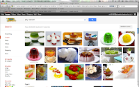
From looking at desserts on the bbc website i decided that i wanted to do something with jelly/gelatine. I thought that this would look really good and its something different to do. I couldn't find any sort of recipe on the bbc website for this, so i searched in google.

Here are some images of jelly desserts.


I really like the idea of the ones either layered up or colours within each other.
After looking further i found out that the one with colours inside each other was called Stain Glass Jello and it is really easy to make. So this is what i am going to go with. 
Now just the design!

Sunday 4 December 2011

Currency

China

The Renminbi is the official currency of the People's Republic of China (PRC). It is the legal tender in mainland China, but not in Hong Kong and Macau. It is abbreviated as RMB, and the units for the Renminbi are the Yuan (元), Jiao (角), and Fen (分): 1 Yuan = 10 Jiao = 100 Fen. Fen have almost disappeared, so the coins in circulation are one yuan, five jiao, and one jiao. Banknotes range from one jiao to one hundred yuan, and vary both in size and colour. The distinction between the Renminbi and the Yuan is similar to the distinction between the British Sterling and Pound. Renminbi refers to the whole Chinese money system whereas Yuan is the base unit of Renminbi. Yuan is used to denominate bills, and is the unit in which prices are measured.

Hong Kong and Macau have their own monetary policies and currencies, the Hong Kong dollar and the Macanese pataca, respectively, that may not necessarily be compatible with the renminbi.

Currency of some type has been used in China since the New Stone Age. The Chinese also invented paper money in the 9th century.

China, Yuan Renminbi
The Chinese Yuan Renminbi is the currency of China. Our currency rankings show that the most popular China Yuan Renminbi exchange rate is the USD to CNY rate. The currency code for Yuan Renminbi is CNY, and the currency symbol is ¥.
Top CNY Cross Rates


1.00 USD=6.35950 CNY
US Dollar Chinese Yuan Renminbi
1 USD = 6.35950 CNY 1 CNY = 0.157245 USD

1.00 GBP

=

9.92088 CNY
British Pound Chinese Yuan Renminbi
1 GBP = 9.92088 CNY 1 CNY = 0.100797 GBP


Hong Kong, Dollar
The Hong Kong Dollar is the currency of Hong Kong. Our currency rankings show that the most popular Hong Kong Dollar exchange rate is the USD to HKD rate. The currency code for Dollars is HKD, and the currency symbol is HK$.

Top HKD Cross Rates


1.00 USD=7.76778 HKD
US Dollar Hong Kong Dollar
1 USD = 7.76778 HKD

 1 HKD = 0.128737 USD
1.00 GBP=12.1178 HKD
British Pound Hong Kong Dollar
1 GBP = 12.1178 HKD 1 HKD =0.0825232
GBP


American

The United States dollar, also referred to as the American dollar, is the official currency of the United States of America. It is divided into 100 smaller units called cents or pennies.

The U.S. dollar is the currency most used in international transactions and is one of the world's reserve currencies. Several countries use it as their official currency, in many others it is the de facto currency, and it is also used as the sole currency in some British Overseas Territories (British Virgin Islands and Turks and Caicos).
United States, Dollar
The US Dollar is the currency of United States. Our currency rankings show that the most popular United States Dollar exchange rate is the EUR to USD rate. The currency code for Dollars is USD, and the currency symbol is $.
Top USD Cross Rates


1.00 GBP=1.56001 USD
British Pound US Dollar
1 GBP = 1.56001 USD 1 USD = 0.641022 GBP
1.00 EUR=1.34045 USD
Euro US Dollar
1 EUR = 1.34045 USD 1 USD = 0.746016 EUR