

For the publication, i decided to use a three column grid to each page, giving each double spread 6 columns. I have used this because the three columns on each page will give me more flexibility with the design of the page, as i can mix the the text and image up alot more with this adaption.

The image above show the master page of each page. This has the book title and page numbering included. The idea of this design is to mimic that of the front cover, this keeps it consistent throughout the publication and makes it more professional. The page numbering is highlighted in the red used throughout the publication to make it stand out more so the reader can see what page number they are on.
Moving on from these I have shown some screenshots of the publication, to explain the way they are designed and why i have the design for it.

Even though the page is split into three columns it can be reduced to two columns by stretching aspects over two columns, this works well for a spread which includes lots of images and a smaller amount of text, like the one above. With the about section i have a select amount of information about each year period, to match this i will use a advertisement of that time to try and show what the information is saying. This shows the flexibility of the three column grid and how it can be adapted for different purposes.

Title and fact page. Beween every chapter i have decided to put a fact about coca-cola in. This is to give the reader some small fact file style facts about the company and to showcase some of things maybe people wouldnt think about the company or know about the company. Its just a little insight into the company further. Also within these spreads i will work the title of the next chapter, each spread like this will include an image that is related to either the fact or the chapter - i have tried to match all three elements together to make it work better as a design.

This spread is one which involves much more text and becomes more of an article within the publication. Again using the three column grid to my advantage i can span the text over two columns and use the latter one for images, to make the design more interesting, i have spread one image over two columns, which merges into the text area, but makes the spread look much more interesting and inviting.
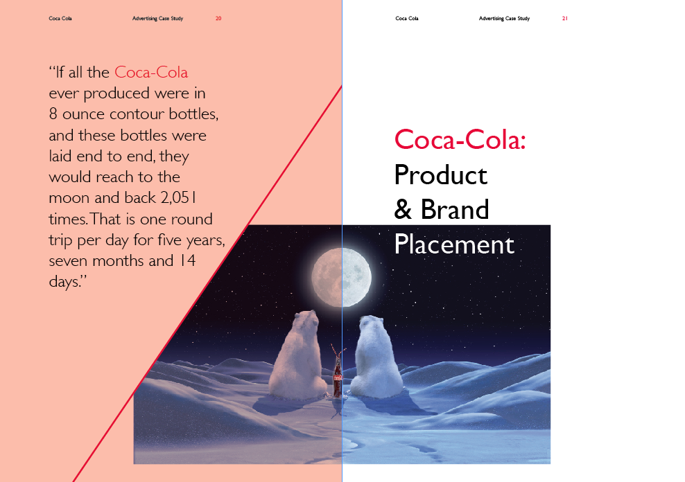
Again another spread to cover the gap between chapters. This is a good example of the use of the image within the title and fact. The next chapter is about product placement and the brand, the image is an advertisement which has the coca-cola bottle right in the centre and uses the polar bears which are part of coca-cola brand values. This all links in with the fact about coca-bottles and how many are drunk. The design with the diagonal line, both splits the page up, but also connects the two together and also creates more of a design which can be worked with over the two pages.

Another page within the publication, this one has more images than text and this means the images tak priority within the spread. As mentioned before the three column grid allows alot of lee way and i have taken this for granted within the design. Using two of columns but leaving the end one blank, creates alot of white space within the spread, which works well for the images as there is nothing taking away the attention from them. The minimal text sits well within the off centered alignment, which is done on purpose because naturally you always look to the left of a book first, putting the info there will make the reader pay more attention to that section before the images.

One of the more interesting sections of the publication and more creative within design of it is the coca-cola vs brands section. This is the comparison of coca-cola and pepsi which created a cola wars. The main illustration for this section is the pepsi logo made out of the coca cola logo lettering. This is a play on the idea that both brands create the same product, but are different and have different audiences. This section has a different layout again within the three column grid, with the illustrations taking up one page, all the info has be on the second page, making that text heavy, but it levels itself out because of the illustration.


Image based pages towards to the end of the publication - these are still structured within the three column grid, but by spanning some images and not others i can create a visually good composition within the page. The top spread includes brief information about the images and what advertisement they are etc. Whilst the lower spread just has the title on the pages, this will include a further insert, in the form of a tip in, this will include information about the campaign and the idea and theory behind it. Having this on a separate insert means there is more room for the images and they can be larger, the tip ins also make it more interesting to read.

The final page is blank. This is because i will place the disc which holds the digital resource on here. This will be enclosed in a card holder.

The contents spread includes all 6 sections of the book with the pages numbers, this again is created within the grid system, but has a very visual aesthetic to it, with the images for each of the sections. I wanted this to be a glimpse of what is to come throughout the publication, which i think works well, the added body copy on each side balances both pages out and makes it sit nicely as spread and the introduction to the publication.
After designing the publication i test printed some of the pages within the publication to make sure it was all okay and ready to be printed properly.


I was happy that i did text print the pages because i found that the titles were too big for the proportions of the layout on the page. This needed to be reduced so it all balanced out better. I was happy with the quality of images, this was a big concern because a lot of them were found on the internet and i wasn't sure if they would be good enough quality for print, but they have done okay. I just needed to adjust the title point size then the publication will be ready to print.
FULL PUBLICATION
No comments:
Post a Comment