Thursday, 9 May 2013

OUGD501 // Theory to Practice // Publication Layout

From doing the selection of page layouts, i was able to start designing the publication quite quick and was getting through the design fairly easy - this paid off doing the page layouts first and just having to drop the text and images in.

I started off with the beginning of the book and did the about coca cola section. Using the page layouts i created the first chapter of the publication. But after doing it, i wasnt happy with the design.


I set out wanting to create a really visual publication and having the advertisements as the main focus throughout the publication. This is why i took this design style on and started to created the publication, but as i kept looking back over the chapter i found myself less and less happy with the design. I dont think this is correct for the publication and gives the wrong impression when you look at it. Also i was finding it hard to think how pages that have more information and less text would fit within this style.

I sat down again and thought about the content of the publication; i needed a change and a radical design style change, because this wasn't working for me. 

After thinking and drawing out ideas and plans, i came up with the idea of expanding the publication. I thought i could look at Coca-Cola as a brand and look into what makes them a successful brand and the things they have done in order to become this great success across the world. This broaden the content of the publication and made it more of guide to branding and advertising. I was still going to focus on the advertising side of the company, but by bringing the branding in and looking at how they did things to make coca-cola as a brand so big, will improve the publication and give it more meaning. 

Deciding this i started to hash together a running order for the publication and how to set the publication out. 

Front cover
Contents
About Coca-Cola
Coca-Cola Brand Success
Coca-Cola product and brand placement
Coca-Cola vs Brands
Coca-Cola A history of Ads
Coca-Cola ads case study
Page with digital resource
Back Cover

I think this content within the publication spans the whole of Coca-Cola and covers the ideas of the brand and what they have done as a company to become so big. This also means that i can cut down certain chapters to make room for the new ones i have added. 
All in all the publication will 56pages, which i think is a considerable amount. 

In terms of the publication layout i am going to still keep it visual throughout but have a more structured and gridded system to the layout. 


These sorts of layouts are what i am going to take inspiration from to create the publication layout. I think this will give a good balance of text and image and give me the flexibility for pages that need more text or more images. 


Tuesday, 7 May 2013

OUGD501 // Theory to Practice // Design Sheets

With the idea behind me and now knowing what i want to do with this idea and concept for the publication of the module, i have started to look at the design aspect of the publication. The main thing i need to sort out is the layout and style to the publication. I want the publication to be very visual and show the content i want to communication mainly through imagery, with text when needed and to explain the more longer and detailed section of the book.


Planning the idea of the publication and what content would be within it. 


Focussing down on the publication being about coca-cola and how the content of this will fit together to create the publication. 
Order of the publication set out so i know what i need to design to. 


To start with i have started to look at the layout for the publication, looking at imagery within the layout and then both image and type and seeing how i can combine the two together to create a good mix and strong layout with structure for the publication.


Page layouts for the imagery pages - this is mainly for the case study and history of advertisements. 


Page layouts for text and image pages - the majority of the book will be based around these layouts - so i needed to get it right from the beginning. 

I have also started looking at the design for the front cover.

Front cover designs


How the front cover and publication works together


perfect bound publication


Publication held with binding screws.


Overleaf front cover design. 


From these designs, i am going to now mock up the ones which i like the most and think would work the best for the publication. Once i have done this, i can simply copy and paste the layout to the document and add in the imagery and body copy when needed. I think this is a more effecient way for me to design personally, and i get to look and feel the design of the layout before all the content is added which makes it harder. By using a placement image and placeholder text, i can still get a feel for what the design of the layout will be with all the correct content.


Now having done these layouts and getting everything designed right and laid out to how i want them, i can start on the proper document and start to add the content and images. This should hopefully make the process alot easier by having the layouts done and sorted.

OUGD501 // Theory to Practice // Inserts

Within the publication i am going to do a case study section, this will look at a selection of advertising campaigns from coca cola. With this i will analyse and write my own interpretation of what the advertisement is trying to make the customers do / think. 

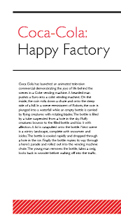
In the publication the images of the campaigns will be printed in it, with the rest of the content, but the information about the campaigns and the theory behind it all will be printed onto a smaller stock, which will act as a tip in on the publication page. This will be printed double sided to hold the two separate sections of text about the campaigns. 


The designs above show the inserts, these will be printed onto a pale pink stock to match that of the colour used on the title pages within the publication. This also separates it from the stock of the main publication so you can see it is information about it and something different from the publication. 

The design of the insert revolves around the spacing for the information. I wanted the insert to have some design to it but also to leave enough room for the body copy of the insert. The lines at the top separate the title from the rest of the information and make this clear what it is about, the red stripe section at the bottom is more for the aesthetics than anything else, this brings the coke red colour into the design and makes it more interesting to look at. The inserts are structured well and the design is carried across all of them to make them the same and work as a set throughout the publication. These should fit and lay well within the publication. 


OUGD505 // What is good // Wayfinding further research

After coming up with the idea and concept for the wayfinding system and how it will work along with the wayfinding app, i have gone back to research into some more ideas for the wayfinding system within the museum that will work around navigation.

like the simple illustrations which make up the icons, the use of the bright yellow in the background makes them stand out and would be good out in the environment as these would stand out there too an everyone would be able to see them. 

Very informative with the arrows, this gives clear instruction to the visitor of where to go but also looking good as a design too. I think it could be complicated to follow. 

Simple, precise, good design, does what it sayd on the tin. 
Really clear icons and the use of the black background makes them stand out against anything - i like the see throughout elements so the wall can be shown through - this could work well if the wall was coloured.


bright and colourful, big and easy to read. At the National media musuem the way finding comes in the way of arrows, but big ones like this on the side of this wall here in the photo.

Again using the wall to create the way finding on. by printing direct onto the wall i suppose you would save on money, but it also makes the walls more interesting and infact does the number etc become an art peice on the wall?

More clear and simple illustrations which stand out against the bold and bright background. 

Simple and small directions attached the to wall. I think this could be too small though and not stand out enough to atract the visitors and make them stay within the exhibition / navigate around them. 

Cool acrylic signs, love the colours of these, the boldness defiantly stands out the most. Again the use of arrows and direction have been used within this way finding. 

Made from steel / i think this is defiantly right for a bookstore / shop but i dont think the drink at this free would be open still.  

Another direction form an arrow, which is oversized again. The arrows are definitely present in alot of exhibition branding. 

again i like the use of the arrow wihin the certificate of my documents? I think the idea of direction and taking it literally like would be a good idea to use within the exhibition, especially if it was to be on a large scale like the image below, it creates a god atmosphere around the place. 

big bold yellow - oversized use of the sign is a good idea. makes it very clear about what is around and brightens up the museum a little too. 

Nice colours that have been used, they all compliment each other and would work individually too. I like the colour choice and think this is a positive towards the design. I think this could tie in nicely with the idea of my way finding app. 

I like the use of the lines throughout this exhibition - it gives a feel of the underground. It is a simple way in to direct people around the museum. 


more simple, small illustration which can be used throughout an exhibition