
After deciding that i am going to use the exhibition title as my idea for the brief, I have started to look into exhibition promotional print colateral. Here i have looked a range of products which will all be linked with the idea of exhibition promo. These are items such as posters, invites, brochures, website, packaging, gifts etc. These all make the event look like a fully thought out design idea and all are a way to brand the exhibition.

With this design i like the colours used within the branding, the logo is very strong and stands out well within the design of the branding material.

I like the format of this invitation, the printed front side looks good when you first pull it out of the envelope. The envelope net is also a good choice.

The yellow and black work well together here and make it vibrant, which makes it stand out alot. The colour has been carried throughout the publication to tie it all together, again this works well with the body copy being printed in black over the top.


The new nordic, i like the colours being used within the branding, they compliment each other very well, also working with the white and the grey background colour.
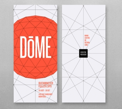
This flyer / invitation is great. I love the illustration within it and the bold orange colour used throughout. The type works well too. This is all considerations that i need to think abut when doing this for myself.

This shows a great product range within the branding. The shapes are shown across the different products and the ranges of them too. I like the vibrant colours used within it all and think that the shapes create good visuals for the book.

This black and white imagery within the poster works really well and brings out good definition within the photograph. Personally i think it would have been good to have a coloured background. But this gives me good ideas for using the black and white imagery within my own work.


These two images show the content of a envelope and designed information within it. I think this is some sort of mail out. The colours used in the top image for the background of the information, fit together well and work as a set of palette colours. This also breaks down relavent information into different categories.
The envelope is in keeping by the colour of the corresponding the information sheet and the net of this envelope looks good too, it doesn't look like a box standard envelope from the shelf.

web presence - the use of the orange within this and overlaying the photos makes it more interesting to look at. I like the grid format that the web page is in.


Interesting packaging, which has the information needed to communicate to the user but then also hold the disc etc that te packaging is holding. This makes the packaging hold everything in once place and be sent out in an interesting format which makes it interactive for the user.


These images above are all part of the same branding. Again you can see here how it has been applied across the range of products, but still looks the same nonetheless. I think this is something that i need to keep in mind and make sure that i am working with the brand identity but applying if accordingly to the format and size of each product. The use fo the imagery and overlaying colour works well and is something which i think could with my concept and work.


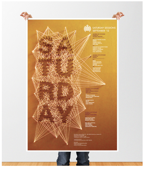

Another set of images which show a range of posters. I think this is really interesting, the use of the string to create the words looks really effective on the poster and catches your eye when you first look at it. The colour used for the designs are very bold and deep colours.


This set of 3 type based designs are all part of a bigger set of designs. I picked these three out because they were the ones which caught my eye the most. I think the composition of them is great and the use of the type within the posters is used well to make you look around the whole area and see every bit of it. With the ones that incorporate image within the design, the type is built around this and made as though it is coming from the image.

I like this for the format of the design. I think this is interesting in how it is folded up how the type is arranged within the design to make it readable as you open the folded sheet.

The arrangement of this branding looks great, this is also something that i need to think about when i am photographing my work. The design of the work is interesting an looks goo with the colour choice. The stock used works well against the design and colours that are incorporated within it.

Good installation material or something that could be adapted for a way finding system within the exhibition space. I like the idea of this and the layout of it the type within the shape.
No comments:
Post a Comment