
So i am going to be very precise with the content and only put in the necessary information, which will be cut down to the minimum it can be.
I have started to have a look at some designs which i can take inspiration from for the design of the publication.


Here i like the simple shape that has been cut into the stock. The size of these really emphasise against the size of the publication and act as a window to see the other stock within the publication. A great way to being interaction within the publication.
Again i like how the cutting into the stock and using a different one beneath brings a new dynamic to the design. Especially when you cut into it using a different technique and working within the 3D element - just just cutting it straight out of the stock.

The publication is going to be split into different sections, having these section different formats and working within each other can again make it more interactive to read and also has a great aesthetic to it.

The layout of this spread is nice, i like the placement of the image and type and how the overlap of these bring the two elements together and make them work together. This sort of layout and design could also work well within my publication.

Again the bold type used in the publication makes the important information stand out, the use of different point sizes and styles of fonts can also make a different on this, as the pages of my publication will include information about the stock, I think using the type like this will work more to my advantage.

The bold colour really stand out here, and the bold type also does. I like how the branding and idea has been spread across the different formats and products, this could work for my products, using the branding i have thought of.

nicely laid out deisgn with the use of white space used to a maximum. I like that there isnt that much body copy but yet it still looks balanced on the page.

Great use of type and point size within the layout. I like the master page design of the spread, with the lines at the top, this gives it a sort of importace and like a guidance book. It shows organisation.

Neon pink stands out great and makes it eye catching, the use within the illustrations and body copy highlights this colour and the use of it throughout the publication to highlight key points and information.
Structure and layout of the publication have been well considered.

Again a string colour used as the main accent colours, this is very vibrant and contrasts against white and black used within the publication.

The use of the shapes and blending modes on the publication creates a simple and strong design to the publication, the range of colours used within the range of publication works together well too.

great use of a grid within the spread design. The type has been well thought out, along with the layout of the whole page. Even though my pages are going to be shaped, the type can still be considered and laid out well within the page.

Bring vibrant colours used throughout the publication. Creating the cut out on the front cover makes the insides interact with the front of the publication and brings out the element of interactivity.

Strong and durable packaging cold be needed to use for posting the publication. Definatly some sort of packaging will need to be thought of, i like the use of the natural looking card stock.

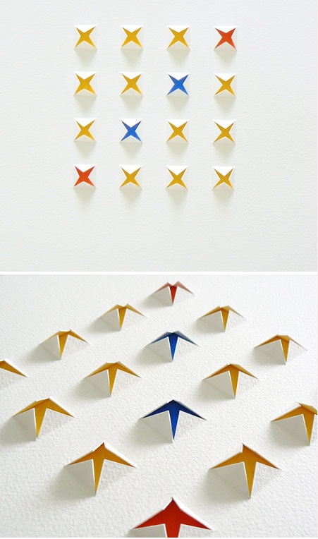
A creative way of using a flat design and making it 3D using simple paper craft. This would work well within the light creating shadows of the type, but also looks good as a printed poster.


Great packaging ideas, using a celephane bag / jiffy bag, could both package the publication but also protect it in the post. It could also become part of the aesthetics of the branding for the publication.
No comments:
Post a Comment