
A desktop that publishes.
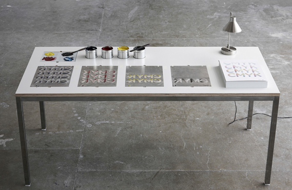
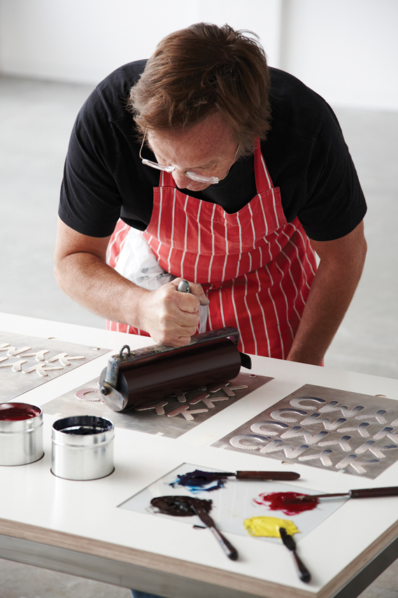
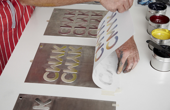
Graphic designer Peter Chadwick and Chelsea College of Arts graduate Jonny Holmes have designed an analogue take on desktop publishing, creating a desk with a built-in manual printing press.
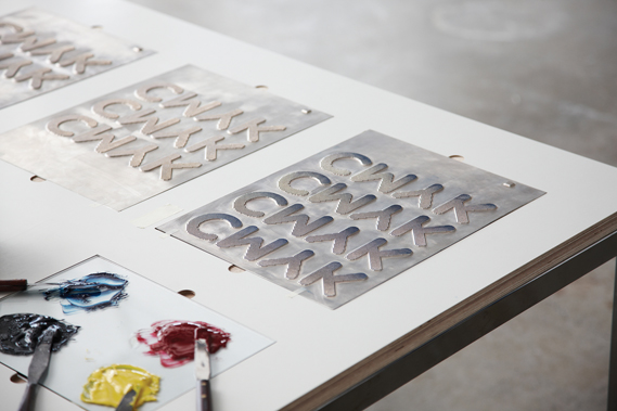
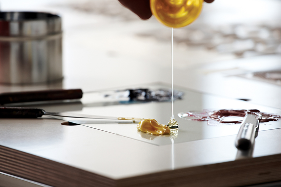
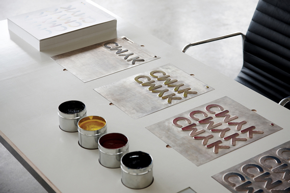
The printing press prints up to four colours at a time and plates are interchangeable so any design – or combination of designs – can be used.
“The phrase 'desktop publishing' was often used when I took my first steps into the design industry in the early nineties, and conjures up images of poorly designed, mass-produced print literature. The table provides an antidote to this, delivering well-crafted, bespoke hand-printed posters,” explains Chadwick.
“The original idea was for a one-off concept piece, but I see the potential in mass production – it could be used as an educational tool in schools and colleges or even as furniture in the home,” he adds.
An associate graphic design and communications lecturer at Chelsea, Chadwick came up with the idea around two years ago but struggled to find time to work on the project until he met Holmes, who was a student on the course.
“I approached Jonny and briefed him on the project, and he produced some visuals in response. He was invaluable in its development, sourcing materials and assisting me throughout. From briefing to manufacture, the project took around three months,” he says.
Chadwick is now in talks with a Dalston gallery about using the table for live poster printing to coincide with the launch of a new exhibition, and hopes it can be used for future design and illustration projects.
Also a Chelsea College of Arts graduate, Chadwick started out designing record sleeves for Williams & Phoa – including Primal Scream's Screamadelica – before setting up his own design studio, Popular, in 2007.
The desktop that publishes is the first in a series of projects he has planned under experimental Popular offshoot A Popular Project.
“APP will be a platform to showcase personal and studio generated ideas, including collaborations with other creatives,” he says. Follow-up projects under consideration include one involving customised musical instruments and another involving Dekotora, a Japanese decorated truck.
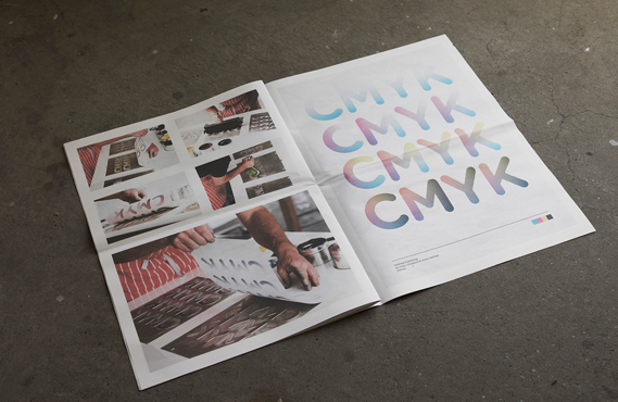
Popular has also released a promotional newspaper about the project featuring photographs by David Ryle (below).
A twist on a traditionally printed magazine.
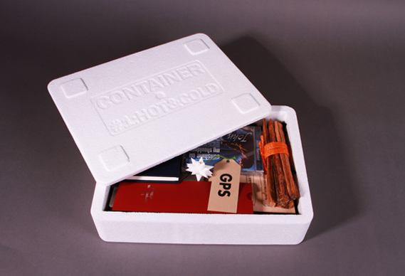
An intriguing polystyrene box of artefacts, Container is the latest project from Artomatic's Tim Milne. It has contributors, a theme, content and ambitions to be produced regularly - so that does that make it a magazine? asks Jeremy Leslie
However many times you try to replace it with ‘publication' or ‘periodical', the word ‘magazine' remains the most pertinent, direct word for what I spend most of my days thinking about. Those other words just don't hack it, and remain only as useful secondary alternatives along with adjectives like ‘annual', ‘biannual', ‘quarterly', ‘monthly' and ‘weekly'. You can sometimes get away with the abbreviation ‘mag' but even that's best saved for deeper into the article, once the full word has set the scene.
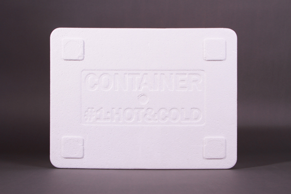
Container #1: Hot & Cold
So what happens when you're developing a magazine that is consciously unlike others? At one level we find ridiculous made-up words such as bookazine and mook, words that exaggerate the difference between magazine and book. But what if your publication is really different? This was the challenge facing Artomatic's Tim Milne when planning his new project Container, a box of objects created by a group of invited contributors in response to a theme.
Expressed like that, the metaphorical link with the traditional form of printed magazine appears obvious. Milne has set a theme, invited contributors to respond, and is publishing the resulting collection as a set. Not so different to the copy of CR you're reading now? The finished item, though, could hardly be more different to CR, and calls into question the very nature of what a magazine is.
When talking to Milne, the conversation is littered with phrases such as "a magazine that's not a magazine", as he struggles to define Container in relation to traditional print publications. Yet Container is an ingenious name, as it describes the physical reality of the project as a box of objects, while also referring to the origins of the word ‘magazine'.
"It's actually close to the original definition in its meaning of warehouse or repository to hold things in," Milne explains. "It's a colloquialistic stretch that we think a magazine can only be a printed book."
There have of course been other magazines that have resisted the bound, printed format. Last year the 1960s art magazine Aspen was exhibited at the Whitechapel Art Gallery to much excitement (as reviewed in this column at the time). "What struck me about Aspen was that it didn't deviate that much from the printed format," says Milne. "Most issues were really just a handful of printed pieces presented in a box." What caught his attention was that even without stepping so far from the traditional format, Aspen was powerfully different to most magazines. "With Aspen you got something a lot richer and more fragmented, you got the sense that each individual item is the product of that contributor. The relationship is with the individual contributors and not with Aspen."
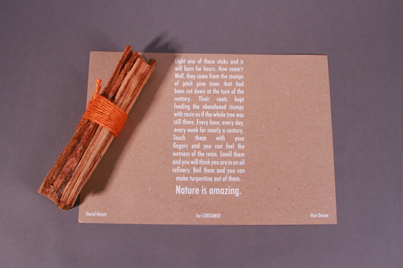
David Hieatt's contribution to Container – a bundle of pitch pine twigs
Milne has taken this a stage further by pushing the contributions to Container beyond print. "The brief was to make an object based around the theme ‘Hot & Cold'. It could be both Hot and Cold, or just Hot or just Cold. We said the objects would be put in a box determined by the things you make - implied in that was that the things had to be of a hand-held scale."
The ten contributors encompass a rounded selection of different creative areas: graphic design (Malcolm Garrett), advertising (Mother), art (Daniel Eatock), product design (Nic Roope and Violetta Boxill), entrepreneurship (David Hieatt), writing (Leila Johnston). For future issues, Milne would like to broaden that out. "An object is a fundamental human language. Artists and designers shouldn't have a monopoly," he says, listing economists and scientists as possible future contributors.
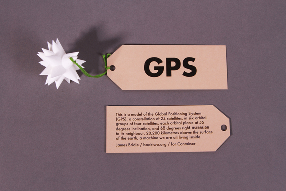
For his Container contribution, James Bridle created a 3D printed model of the GPS system
So what can you expect from issue one? Under the name Artomatic, Milne has been sourcing creative print and production for clients since 1982 so it's no surprise that the attention to detail across the whole project is remarkable. Milne has collaborated closely with his selected contributors, helping them execute their ideas in the most authentic manner.
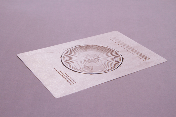
Design studio Accept & Proceed's diagrammatic etching of routes across the North and South Poles
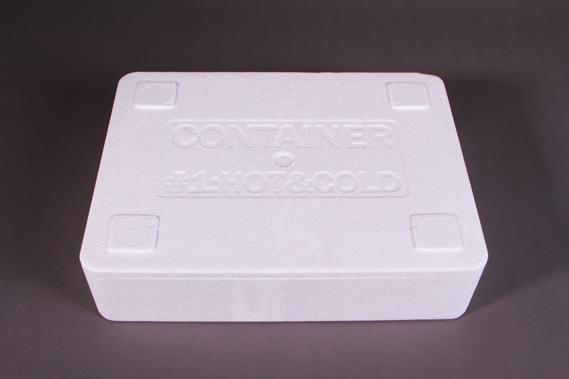
The objects arrive packed in a polystyrene box, perfect for keeping the contents hot or cold, and inside, the ten objects range from a small hardback book to a length of heat-sensitive till receipt paper via a bundle of wood and a 3D-printed object. Most contributors have been seduced by the opposition of Hot and Cold, and only one, Accept & Proceed, went for Cold alone, with a diagrammatic etching of routes across the North and South Poles.
"I don't think it's a coincidence we had so few cold ideas," says Milne, "Hot gets people excited, cold has a numbing effect."
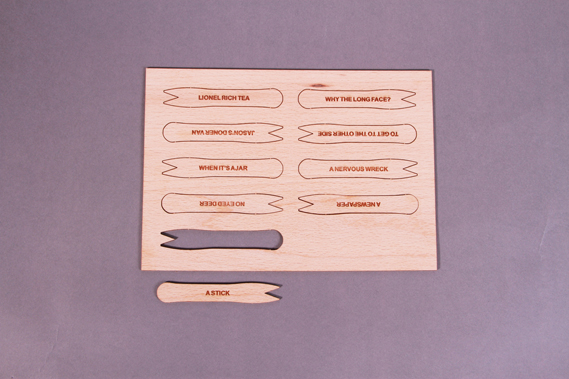
Hot and cold together: lolly stick jokes are transferred to chip forks by Violetta Boxill and Nicolas Roope
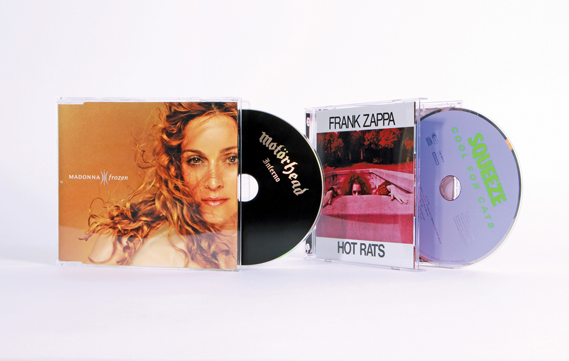
Violetta Boxill and Nic Roope have added lolly stick jokes to wooden chip forks, the surface humour strengthened by the subtle reference to their respective Caribbean and Scandinavian heritages; advertising duo Rebecca and Mike have swapped CDs with their opposites (eg The Very Best of Donna Summer and The Best Of Johnny Winter), recalling a time when music meant physical objects and CDs and their jewel cases could get muddled (see below).
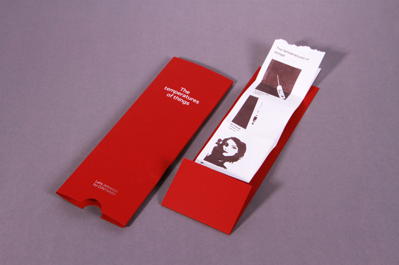
The links between the ten objects and their stories might easily have been made explicit in a printed addition to Container, but Milne has wisely avoided putting written editorial inside the box as that would be a distraction from the objects, almost a "magazine of the magazine," he says. "We can write about it in much more depth online, so that's where the back stories will appear." The polystyrene box will just contain the objects and a signed authentication sheet.
Writer Leila Johnston's contribution uses heat-sensitive till receipt paper
While Milne avoids the use of the M word, for me Container is everything a magazine should be. It has wit and intelligence, great stories expressed visually, and makes the most of both the physical and digital. As a relatively expensive limited edition of 200 it'll be beyond the reach of most but we should celebrate its existence and look forward to it inspiring people in future exhibitions. I can see it at the Design Museum rather than the Whitechapel Gallery, a record of an era when the balance between the analogue and digital is tipping.
No comments:
Post a Comment