
GOOD DESIGN:

I like this website because of the simplicity of the design, i also like the navigation across the top and side.

The simple, plain background works well as it doesn't distract from the wrk being displayed. There is a simple side menu which displays information about work, it is a collapsable style menu. I like that the work shown on the website is large and takes up most of the website area.


I like the use of the orange as a accent colour both in the logo and has a hover when the cursor goes over the image. The way the website is designed makes it look like a collection of images in a sort of gallery/ collage, which i think works well for this type of website (as a portfolio).


Again this website is very similar, except it has more of a structure to it within the portfolio display area, i prefer this style to the one above as it looks better when you first see it. I also like the navigation along the top and the addition information running along. The navigation split the websites down into alot more detailed categories which is also good for finding the right work you want to see.


The one part of this website i liked the most was the navigation along the top, i like the drop down menus and how they display the links to other pages. The area to display the portfolio work, is large and works well for that purpose, but the website as a whole doesnt fit the screen which i find odd.


This is another website which is build around the idea of a gallery in a stacked view. For the purpose of this website i think that it works really well and offers everything you need to use and view it to the best possible way. The navigation down the side is good too, as it breaks down into smaller categories to identify the right area for you. The simple background and design works well as a whole.

Proposed website for Studio Kluif // Pallet
This is a proposed website for a design company, this is for a specific item the company has designed, i guess for promotional purposes and a way to buy it maybe?
What i do like about this website is the structure to it, you can see that its a typical normal layout with it split into columns with a header banner, but its how it is designed around that structure that makes it aesthetically pleasing. The type section on the right hand side catches my eye the most and works really well on the website. I love the red logo going through the bane to set the website and the colour of it too. With a simple navigation along the top of site, it is easy to navigate and makes it easy to use and find relevant information.

Proposed website for rebrand of Italian Furniture brand Extra
The simple white design works well for this site as the images displayed are so bold and strong it draws your attention straight to them, which is what the website is selling.
I like the extra (brand name) being at the bottom, left justified as this isn't a standard layout and makes it different from the rest, its good to see as you move around to find the information.
The navigation is simple and easy to use and it breaks down into smaller categories each time, which spreads along the top of the screen. Great design.

Mark Shale website
With this website the background image sets off the website and everything is worked around that. You can see that the content is set into the boxes but these have a lowered opacity so you can see through to the background image. The layout and content of the website is different and looks good, its also easy to read and navigate around. The navigation is in the box at the top left, which again is different to many ive seen but still easy to use and navigate around the website.


Grip limited website - creative design company.
This website is completely type based as you can see. When i first looked at it, it was hard to understand and see what was where, but when you look for a second time, everything is set into columns and you scroll across the page to reveal more information. The website is set out like a timeline in the sense its long and thin and scrolls along. There is navigation which reveals when you click at the top of the screen, this is easier to find information and work straight away, but i like the interactive sense of scrolling through the website. The type is good to look at throughout the website too.
COMMON DESIGN CHARACTERISTICS:
- navigation along top of screen
- drop down menus
- big images within home page
- scrolling images
- wall of images
- set within a grid
- structured design, that fits full screen
- banners
- good colour schemes
- interesting to look at
- easy to navigate
BAD DESIGN:

This website is really bad, the information isn't in line with the borders set out, the colour of background is a horrible colour and gives the website the wrong feel. There doesnt seem to be any sort of structure or navigation to any of this site.

This website has navigation down the side, but is set in small button icons which isnt very appealing, the background is a dull and boring grey colour and the information on the page, is set in a really thin column in the middle of the screen, leaving alot of unused, wasted space around the sides. Also the header looks like it has been done using clipart or something equivalent.

The colours used on this website are too glarey and don't really work with each at all. The yellow heading on the red background is really hard to read along with the light blue information further down. The navigation is easy to see, but the headings aren't aligned with the shape of the buttons and lacks in the design aspect. The overall website is in a small white box which isn't centred on the screen and has no real structure. This is a really bad website design and wouldn't appeal to me to use at all.

This website has all the standard components you would use on a website and therefore is good on that aspect, but design wise it is a downfall. The website is all left justified and has a big white space next to it which doesnt really work. The navigation is easy to use, but the design of it is like clip art and has no real context to the website itself, along with the website banner taking on these characteristics too. The overall design of the website is very poor and wouldn't attract me to buy anything from it.

Craiglist isn't that bad compared to some of the others, the reasons i chose this as a bad design was basically because it was just a long list of hyperlinks. The website has no real design aspect to it as it is a plain background, with blue hyperlinks on and the heading of the website is done in a standard font.

As a whole the expedia website is average, it has some design elements to it and works as a website because it gets lots of sales etc through it, but what i didnt like about it was the amount of pop ups that come on when you first get onto the website and then the amount of ads there is on each page of the website. I think the structure of the website could be better too, as its all abit all over the place and hard to find the relevant information. But it does work for its purpose as it generates alot of business through the website.

This website again isn't bad as the information is displays and informs you about is all correct and there. The website has useful navigation which is easy to use and multiple pages which are categorised and easy to find. The reason why i say it is bad is because of the design of the website, again it is left justified and has a big space on the right which is wasted, the colours used within the website aren't the best and dont work together and some of the pages are over powered with too much information, which overwhelms you when you first click onto the page. If these issues were to be solved it would be a perfectly good website to use.

http://www.dokimos.org/ajff/This website is just awful, the background is a full on nightmare and a big mistake for the website, it made my eyes go all fuzzy when i looked at it. There is no real information on the page and the heading looks like it is done on word art.I dont really know what the purpose of this website is because it has no information or navigation on it to direct you to anything, so this was a bit confusing really.

With the absci website I didn't like the website being so small within the screen space. The navigation and information within the website is good and easy to view/ use. The banner could do with some re design along with the moving image at the top. Overall it isn't that bad a design, it could just have some tweaks to make it better.

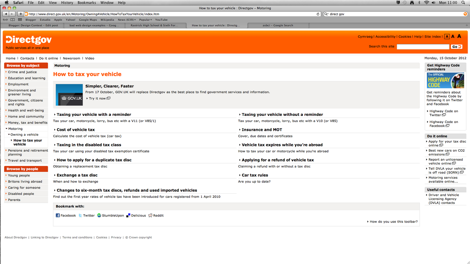

The direct gov website works for it purpose, it has a lot of information which is first thing you see when you first get onto the website, but it is a lot and is overpowering as you don't know where to look or what to do when you first see it. The navigation is good and easy to use. The navigation through the pages aren't so easy and are confusing which to click on for which page to access etc. The website could have a better structure which would manage the vast amount of information better and make it easier to read and understand. With the navigation maybe it be within the main navigation and just be split down into smaller categories instead of in the main page amongst the information. Slight improvements will make this easier to use and navigate around, making the experience much better.
BAD DESIGN COMMON CHARACTERISTICS:
- lots of information
- no structure to the site
- information in no specific order
- navigation hard to use
- pop ups
- sequences within page/on background
- borders which text doesn't fit within
- the website not fitting the screen
- really un interesting design
- bad designed logo/banner
- no colour scheme to the site
- inconsistency
- too many advertisments
Are you going to do a follow up article? Would love to know what happens next.
ReplyDeleteAmela
Web Design Agency
Howdy sir, you have a really nice blog layout “ PSD to Email
ReplyDelete