Showing posts with label OUGD504designforweb. Show all posts

Wednesday, 30 January 2013

OUGD504 // Design for Web // Ipad apps

As i have decided to expand on the web brief and show how my website would work as a ipad app, i did some quick visual research into ipad apps. I looked specifically for apps which used a grid throughout the design and showed imagery in a set structured grid. 

I am wanted to carry out this idea for my ipad app - as the website uses the images in 3 across 2 down grid, i thought adapting this grid to fit into the ipad screen resolution size would work best for the app. Hence why i have looked into apps designed around a grid structure. 

Imagery set out into grids which change in depth throughout the app, these are set at the same size and have the same distance between each image. 

Again you can see that this layout is set out in grid. There isn't any images but you can see the grid structure throughout the page.

Here you can see a solid grid structure in place. Each image is set within the 6 columns and are the same height and width. Even the body copy beneath each photo is the same amount. This works really well on ipad and fits the screen well, making it easy to look through the pages.

Again a good structure used in the app, each image is a different size but it is all still set within the grid structure. This works good to browse through the images, but doesnt look as aesthetically pleasing as everything being the same height and width within the grid. 

Great way to show the images of publications. Here you can see the grid is split down into 3 x 3. Every image is the same size and spaced out the same. This is really effective within the iphone screen size and looks attractive too. 

here we can see that a grid of 2 x 3 has been used, this would be the same grid that i would use and even though its on the iphone screen i think it will work well within the size of the ipad screen too. This structure works best for landscape images, which all mine are, so i think i will adopt this grid and use it within my layout for the app.

Monday, 26 November 2012

Design for web // Inspiration for final scamps

As i have already been looking at websites and looking for ideas on how i would design my own, i was thinking a little bit too ambitious for my own skills and i have realised that i need to re-think my idea and make it much more simpler.

I like the use of colour within this ensign. Also the lines spilt the page up well and make it easier to identify different areas of the page and what information they display.

This is a similar idea again, except i think it is a more elegant design. The pastel colours show a more easy going website and more friendlier on the eye. Again the lines in this website seperate the page up, but i also find myself following them and this makes you scroll down the page.

I like the use of the big picture that stretches across the page. 


The colours of this website represent the company and the idea of healthy eating. I like the use of the pictures and how they are displayed on the page. The information is set out in columns and are set inline with the images.

For me this website is brilliant for whisky / alcohol. It seems to be the sort of design that i would associate it with. The type and the way it is set out all works together well and creates the look of the website. I really like the type and could take the style and idea of it for something in future. 

These designs of websites are much more around the region that i think i can create for this brief and i still think that my own website will be a simpler version of these. We will have to see. 
I have chosen these websites i like the simplicity of the designs, they arent too over crowded and work in proportion to the screen sizes. The information within the websites are clearly easy to identify and read and they all engage the user.
I particularly like the first three designs; i like these because of the way the website is split up along with the information by the use of blocks and lines. I think this works really effectively for splitting the screen up and identifying key areas for the user to read. It makes the information more interesting to look at and easier to read in the first place. The simple navigation within them all is a good thing to take forward to my own website too.  

More research on


Wednesday, 31 October 2012

OUGD504 // Design for print // Understanding Colour for Print & Web


Even though this is talking about colour in the terms of web design, the terminology and meaning of each element of colour, is the same for print as well, just the application of it will be different.

Hue
Hue is the most basic of color terms and basically denotes an object’s color. When we say “blue,” “green” or “red,” we’re talking about hue. The hues you use in your designs convey important messages to your design.
The primary hue of the background and some of the typography on the Happy Twitmas website is bright red.

Using a lot of pure hues together can add a fun and playful look to a design, as done in the header and elsewhere on this website.

Chroma
Chroma refers to the purity of a color. A hue with high chroma has no black, white or gray in it. Adding white, black or gray reduces its chroma. It’s similar to saturation but not quite the same. Chroma can be thought of as the brightness of a color in comparison to white.
In design, avoid using hues that have a very similar chroma. Opt instead for hues with chromas that are the same or a few steps away from each other.

Cyan has a high chroma and so really stands out against black and white.

Colors with very high chroma are best used in moderation, as done here

Saturation
Saturation refers to how a hue appears under particular lighting conditions. Think of saturation in terms of weak vs. strong or pale vs. pure hues.
In design, colors with similar saturation levels make for more cohesive-looking designs. As with chroma, colors with similar but not identical saturations can have a jarring effect on visitors.

The saturation levels of many of the different hues used here are similar, adding a sense of unity to the overall design.

An excellent example of how using a hue with a high saturation against a background with low saturation can make the former really stand out.

Value
Value could also be called “lightness.” It refers to how light or dark a color is. Ligher colors have higher values. For example, orange has a higher value than navy blue or dark purple. Black has the lowest value of any hue, and white the highest.
When applying color values to your designs, favor colors with different values, especially ones with high chroma. High contrast values generally result in more aesthetically pleasing designs.

The high value of the yellow used here really stands out against the lower-value black and gray.

This website combines blue hues with two different values. Because the different values have enough contrast, the overall look is visually appealing.

Tones
Tones are created when gray is added to a hue. Tones are generally duller or softer-looking than pure hues.
Tones are sometimes easier to use in designs. Tones with more gray can lend a certain vintage feel to websites. Depending on the hues, they can also add a sophisticated or elegant look.

Tones can give websites a sophisticated look while adding some vintage and antique flair.

Tones can be intensified by adding gray around them, as done here.

Shades
A shade is created when black is added to a hue, making it darker. The word is often incorrectly used to describe tint or tone, but shade only applies to hues made darker by the addition of black.
In design, very dark shades are sometimes used instead of black and can serve as neutrals. Combining shades with tints is best to avoid too dark and heavy a look.

Jonathan Moore’s website has a variety of different shades of purple in the background (and a couple of tints in other parts).

An effective combination of shades and tints, particularly in the header.

Tints
A tint is formed when white is added to a hue, lightening it. Very light tints are sometimes called pastels, but any pure hue with white added to it is a tint.
Tints are often used to create feminine or lighter designs. Pastel tints are especially used to make designs more feminine. They also work well in vintage designs and are popular on websites targeted at parents of babies and toddlers.

The blue tint on Fernando Silanes’s website creates a soft and sophisticated look.

Tints combined together make for a sophisticated gradient.

Conclusion
While you don’t necessarily have to remember all of these technical terms, you should be familiar with the actual concepts, especially if you want to master part 3 of this series (in which we create our own color schemes). To that end, here’s a cheat sheet to jog your memory:

- Hue is color (blue, green, red, etc.).
- Chroma is the purity of a color (a high chroma has no added black, white or gray).
- Saturation refers to how strong or weak a color is (high saturation being strong).
- Value refers to how light or dark a color is (light having a high value).
- Tones are created by adding gray to a color, making it duller than the original.
- Shades are created by adding black to a color, making it darker than the original.
- Tints are created by adding white to a color, making it lighter than the original.


Thursday, 25 October 2012

Web Design//Researching website ideas

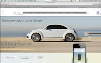
For my own website i would love to design a website which scrolls through and tells a story as it goes along. My initial idea would be to have a scrolling timeline which tells the history of the VW transporters.
To get some ideas i have researched into some scrolling websites and then i am going to see if it would be possible to create something like this, I am aware it would be a lot simpler, but even having a look will be good for me.


After doing the first session of web design, i have realised that doing this sort of website probably won't be able to be produced in the time scale we have and that i don't really know how to do this.
So i have decided i could do something similar to make it look like this, by using a image in website and then clicking through, so it the image scrolls across the website.


These show the idea that i want to take on, but necessarily in the right place, but the idea of a something that flicks through the images, but i want to make it so you actually click it yourself and select the the one you want.