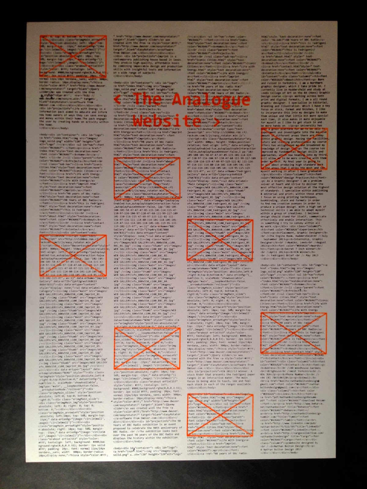
Changing the book sleeve to being on sided, still does the same job and communicates the idea of manual printed vs digital print of the publication. But by having it single sided this now presents itself as a poster, which as a product alongside the publication makes more sense and now works as a way to advertise the publication.
I printed the book sleeve / poster on GFSmith paper that matches the stock used within the publication, this is the mist and pale grey.
Throughout the poster / book sleeve there are some imperfections where it didn't print so well, but I like the result of this as it shows that print is not perfect and each time something different could be printed. It gives the design character and understanding that someone has put effort into creating the print.
To create the book sleeve, the poster folds up to fit around the front cover of the publication. To do this each side of the poster folds in to show the inner two columns of the poster and title
The top and bottom of the poster then folds in order to fold it around the front cover.
When the book sleeve unfolds is shows the full poster.


No comments:
Post a Comment