Showing posts with label OUGD504. Show all posts

Wednesday, 30 January 2013

OUGD504 // Design for Web // Ipad apps

As i have decided to expand on the web brief and show how my website would work as a ipad app, i did some quick visual research into ipad apps. I looked specifically for apps which used a grid throughout the design and showed imagery in a set structured grid. 

I am wanted to carry out this idea for my ipad app - as the website uses the images in 3 across 2 down grid, i thought adapting this grid to fit into the ipad screen resolution size would work best for the app. Hence why i have looked into apps designed around a grid structure. 

Imagery set out into grids which change in depth throughout the app, these are set at the same size and have the same distance between each image. 

Again you can see that this layout is set out in grid. There isn't any images but you can see the grid structure throughout the page.

Here you can see a solid grid structure in place. Each image is set within the 6 columns and are the same height and width. Even the body copy beneath each photo is the same amount. This works really well on ipad and fits the screen well, making it easy to look through the pages.

Again a good structure used in the app, each image is a different size but it is all still set within the grid structure. This works good to browse through the images, but doesnt look as aesthetically pleasing as everything being the same height and width within the grid. 

Great way to show the images of publications. Here you can see the grid is split down into 3 x 3. Every image is the same size and spaced out the same. This is really effective within the iphone screen size and looks attractive too. 

here we can see that a grid of 2 x 3 has been used, this would be the same grid that i would use and even though its on the iphone screen i think it will work well within the size of the ipad screen too. This structure works best for landscape images, which all mine are, so i think i will adopt this grid and use it within my layout for the app.

Thursday, 24 January 2013

OUGD504 // Colour for print STUDY TASK

As part of the research and presentation we have started collating for Print Processes we were set this task to tie in with the previous task of Design for print.
Taking the same categories as that task:
- Branding & identity
- Packaging & promotion
- Publishing & editorial
- Information & way finding
but this time to look into the categories for the purpose of colour, so I will look at:
- CMYK (process)
- Spot Colour (2 or more)
- Monochrome & Tints (solid colour and half-tone).

For each category i will look at each colour process and find examples of each.

----------------------------------------------------------------------------------------------------------------------------------

RESEARCH
Spot Colour
- Editorial & Publishing


Spot Colour - yellow, used throughout the publication. 


Spot colour green - used on headings.

Spot Colour - neon yellow - printed over black and white packaging.

- Promotional

Spot green and red.


Spot colour ed


Spot colour red.

Spot colour red on white.

Spot colour pink. On white and blue print.


 CMYK
- Editorial
Shortlist magazine - CMYK print throughout the magazin.


Showing the CMYK articles and imagery.


Newspaper - CMYK process.


Newspaper - CMYK process used throughout.


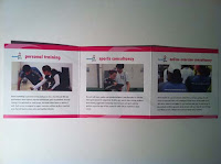
Gym Fitness brochure. CMYK used throughout on the imagery.

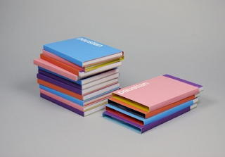
CMYK book covers.

- Packaging

Pink print on packaging paper bag.

CMYK print packaging.

Printed milk packaging using CMYK process

orange and black CMYK packaging.


- Branding & Identity

CMYK printed business card


CMYK printed business card.

Monochrome & Tint
- Editorial

green tint publication.


monochrome black publication.


monochrome, burgandy newspaper print.


- Promotional

black and white flyer design.

monochrome flyer which yellow accent.

monochrome flyer.

monochrome and tint flyer.

 - Packaging

one colour printed packagaing.


- Branding & Identity


----------------------------------------------------------------------------------------------------------------------------------

SECONDARY RESEARCH
Publishing & Editorial
- Spot Colour


Spot colour front covers.

spot red using within the titles.


Spot blue colour used on front covers.

Spot green used within the publication article.

Spot yellow, orange and silver on top of each other.

- CMYK
CMYK imagery used within publication

CMYK background block colour.

CMYK editorial imagery.


CMYK imagery and overprint of title and body copy within DPS.

multipage document using CMYK printing process.

- monochrome & tints
tint within publication front cover.

black on white print.

black and white article page.

black and white content page.

Black and white editorial pages.

Branding & Identity
- Spot colour
Spot green used throughout branding.

spot orange used as paper stock and labels.

spot blue used in the branding.

spot red used throughout branding.


-CMYK

- Monochrome & tint

black and white screen prints.

black and white laser cut business cards.

Black and white printed business cards.

blak and white business cards.

monochrome identity.

Packaging & Promotion
- Spot colour
spot purple used on packaging.

spot colour for pantone colour set.

spot colours used on coffee promotion.

- CMYK

green and yellow CMYK packaging.

Fruit CMYK packaging set.

CMYK chocolate box.

-monochrome & tint

one colour black print.

white labeling applied to honey jars.

one colour print on bag label. One colour print on bag itself

Information & Wayfinding
- Spot Colour

spot colour red on poster.

spot colour red on signage

spot colour - yellow - throughout publication DPS

Spot colour green on signs.

- CMYK

CMYK print on inforgraphics

CMYK info graphic poster.

Mcdonalds CMYK print info graphics.


- Monochrome & tints
Once colour with tint type poster

Tint with blue colour on infographic poster.

Once colour wall decal.

one colour way finding signage.

tints on info graphic information page.