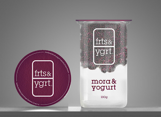
For the design of the bottles which i want to do and the direction in which i am heading for, i have looked at some other packaging which is similar and takes on the same approach, these are all around the same sort of healthy eating.
Frts and ygrt
With this packaging i like the way in which the packaging is see through so the contents of it can be seen. The headings of the packaging is in similar colours to the fruits which work well to link the type and contents of the packaging together. I also like the label section at the top of the packaging, this again mimic the layering of the yoghurt inside the packaging.
Tango
With this packaging i was interested with the bottle neck label and the sticker which goes from the cap lid to the bottle. I like the bottle neck label and how it has more information about the drink within it, i think this gives the product something extra and makes it more up market. The lid sticker gives a great connection form the lid to the bottle, it acts as a seal for the drink, but also is something that you can be part of the branding for the drink and be more playful for the visuals of the packaging.
Naked Drinks
With this brand i was interested in the illustrations for the fruits. As this is something that i want to include within my own packaging it works well to look at other ones out there. For the sort of design i want to do with my packaging, these illustrations are too full on and abit too intricate for me design in the first place, but i like the aesthetics of them and colours to use. I think i will take a much simpler and basic route for my illustrations.
Bionativa
Again i have looked at this packaging for the aesthetics of the illustrations, I think this is more along the lines of illustration that i want to go down and suit the style that i am going to be using for the packaging. The colours of the packaging are great too, they are bright and vibrant and make the packaging eye catching on the shelves.
A Healthy Handing.
This project is completely opposite to what i am designing, but i liked the illustrations used within this app. I think the simple nature of them make them stand out more, especially with the coloured squiggle behind the illustration. I think using and outline illustration will work well for the design as i am going to use the fruit drink as the colour for the label.
Healthy Heart.
With this packaging it is more along the lines of the way my design is going to be. Here they have used the fruit drink ingredients and colours to be the main colour of the bottles, which works well here, so i think it is defiantly the route to take. I like the type used on the bottles, the way it is structured and laid out makes it really legible even at the smaller size. I think having less information on the front works in advantage too, just having the information the buyer needs to know and what makes that particular drink different makes a much less cluttered design.
From looking at these different projects, I have gained some ideas and things to include within my own packaging, I now know that going down the direction of making the design print direct onto the bottle and using the fruit drink as the ingredients should hopefully be successful and work in the way i want it to for the concept of the project.


No comments:
Post a Comment