Along with the publication there is going to be a disc, this is going to hold the tv advertisements, i was going to produce a second publication that is the same as the printed one but with the videos embedded, but i think this will be a bit of a waste, because the user would read the printed publication and then wouldnt want to read it all again, so i think i will create a reference style book with videos embedded, so you can use the two elements together and refer to the videos when you are reading the printed copy.
For the publication, i have a few different thoughts on how it could be produced.
These first images are a collection of different styles of publication that i think would work well to present this information. The top three images are the ones which i think will work the best, there are elements off these which i like and think should be included within my publication.
On the first image, i love the binding technique, i think this is unique and something i havent seen before, but i think i could replicate it, with this publication i also like the green cover over the top of the front cover, this would also be good to include within my publication.
The second image, i like the binding screws used and the hard front cover. I have used grey board before for a front cover and it works really good as a protective cover, but for this project i dont think i want to use it as its not the professional look and i dont think it fits in coca cola that well. The binding screws could be used well though.
The third image, goes back to the case style a bit - with the binding used i would associate this with case studies or office work papers, which is the sort of style i would think a case study would take on. I could use that binding technique but modernise the design of the publication to work in my favour.
After thinking about the publication more and what i want to produce for it, i have decided that i like the style of the first image. I want to use that binding stitch and look more at the second loose cover. I think this will be a good aesthetic for the publication and give it the look i want it to have.
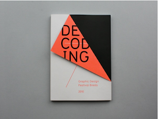
So looking into the idea of having a second loose cover on the publication. All of them have been stitched into the publication.
This works well with the size and position of it, using the full bleed image behind it makes them both work well together.
The vibrant colour of this really makes the publication stand out, the majority of the information is displayed on this section, leaving the cover below to have a full bleed design on.
Using the second cover to interact with the main cover below by cutting out the lettering to show through the design below. I also like the placing of the type on the cover below this gives the publication an informative style and could work with my publication.
Again the bright cover stand out and makes the publication vibrant. I like the large type beneath with the majority of the information being on the loose cover.
The bottom publication i really like, this doesnt actually have a second cover but is designed to look like it. I like the title of the publication being this pt size and that it stretches around the full publication, linking the front and back cover together.
This publication uses different sizes for the overleaf cover. On the front it is a larger size to hold the publication title and logo, whilst the back is much smaller because it only holds a small amount of information. I like this though and think it works well for the publication. If there was a design on the back it smaller cover would be of good use - maybe i could use this if i was to attach the cd to the back cover and that part of the cover could explain what it was.
All these designs have given me ideas, but i think i want the loose cover to be larger than ones shown here, being the same width as the publication, but not as tall. I want the design on the cover below to be hidden by the loose cover, so when you lift it up it interacts with the publication and gives more details about what the publication is. I think i will use the layout of the publication which has the information laid out like a informative publication along the sides.
The second element for this project is to include the CD with the TV ads, for this i need to think of a way to present the publication and cd together. I was initially thinking about having them together and some how attaching the CD to the publication but making it able to be lifted off, but i dont think that will work. Instead i have looked at some creative ways to package a CD.
I really like this idea for the packaging, i think its fun and presents the CD in a good way, im not sure this will fit in with the design of my publication though.
This second design is the way i want to go. I love the way it is packaged and think this would fit in with design of the publication really well. I just need to think how to recreate the way the CD fits in and his held in place. To make it look consistent with the design of the publication i think i may add a cover like the loose one on this too, maybe stitching it to the packaging or attaching some way.


No comments:
Post a Comment