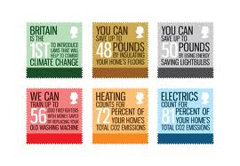
For this brief we dare designing stamps to do with energy efficiency and other things that can help save the world, these stamps are to educate the future citizens, so i thought it would be a good start to have a look at existing designs for stamps in general. I did find some which were actually for this brief but a previous year!
I like the visuals linked in with all these ideas of effecient ways of living
I like the colours used on these, but i don't really like the font or anything else, these colours give the feel of recycling and helping to save the world.
I love the imagery on theses, it is very bold and eye catching, something i could use for my designs
These 3 were from a previous year but for the same thing, i like how they all work together as a set and seeing the booklet design for the stamps helped me visualise what i needed to do for mine, the visuals on the stamps look quite cramped with a lot of information, something i want to stay away from.
Simple imagery, which doesn't need any explantation to it, like the colours too.
This is my particular favourite, i like all the colours used; they all link in with the feel of recycling and reusing and i like the style of the work, they are kept nice and simple and work really well, the information is useful too.
I love these designs, i like how the denomination of the stamp has been used within the type on it, i think its a nice way of doing something on such a small scale.
Experimenting with embossing, not something i would of thought to use on a stamp, but now seeing this, it could be interesting to experiment with this.
Another entry from another year, i like the colours used within these stamps, not too keen on the design of them though.
Simple bold imagery to the stamps, stands out and catches your eye.
I like how the two stamps are linked to together here by the illustration.
Really simple designs for the stamps, i think this is too simple though, it does create a bold statement with just the image but personally id like to see more with the given space.
I like how these designs look informative, the block colours look like some sort of graph in each one, which i think could be good to try out and see the outcome, or maybe just to incorporate that some way into my design.


No comments:
Post a Comment