For the identity for the company, i wanted to do something which can be transferable across all different formats that will be created for this. I have looked at different ways in which this can be made, using different techniques too.
Natural looking board, laser cut elements and long sticker. I like the different processes used on this business card and how they all come together in one thing.
The different colours on each edge makes these business cards more interesting and interesting to look at.
I like the size of the text on this business card, the use of laser cut in them works effectively and looks very good.
Again natural board is used. Laser cut / letter press has again been used and looks really good with the material being used.
I like the material used. The type is in good proportions and the placement of the type makes it more interesting.
The use of emboss has been used here and looks good along with the coloured edges of the card.
This design is interesting with the different shapes and colour of stock used.
I love the use of foiling on this design, the big 's' is over powering, but is balanced by the smaller text next to it.
I like the use of the emboss and deboss that works along side the printed type on the cards. The emboss / deboss areas work as a second line of text but one that is more subtle because it isnt actually printed.
The bright green colour used on the edges of the business cards sets them off and makes them very attractive and eye catching to see. The business name is printed half on each card and looks effective again. I like the use of this.
The stamp for this business card is a great idea, the design on the stamp is simply stamped on to each card when needed. This is a wonderful idea for the business card and something i think i could use for my own practise along with a good idea for this project.
A full range of identity material, the design and concept is carried on throughout all material which works well as a set and looks good.
I like the contrast of the colour of the label and the stock used for the business card.
A mixture of different techniques used on one business card can create a great looking business card
The colour of the stock used i like alot, the back being a different colour works well as this makes the most important information more easily read.
I like the use of different materials, particularly the trace. Its all a natural looking company identity, with the logo spread across them all.
An interesting design, which shows the use of different materials and how laser cut can be used to create something original.
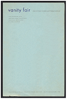
Traditional looking letter head. I like the layout of this and how the style of the design sets off the company identity.
A simple and plain letter head but this definitely works for the company and is a set identity for it.
Creative design for the company identity - using the idea of the badge to cover the cloud i like.
The company identity and design is carried throughout these materials consistently. I like the overprint of some of the heading and titles on the work and think that having one main accent colour makes it stand out and and be more appealing.
The same design is present across all 4 designs but using a different colour on each ones breaks this down and makes it more interesting to look at and be presented with.
This is a simple but elegant design concept across the identity products. This shows that the design doesnt have to intricate or something really complicated.
Again a very simple but effective design for the headed letter. The apostrophe works as both the company identity and as marks for what the company would be saying to the recipient.
Colourful design idea and works across all media. The colours in the design are bright and make it eye catching.
Very intricate design that is well thought out. The design encompasses the date etc within the design and would be marked on the relevant dates.
This design i love, i like the idea of the back of the letter having the a design printed on too. The front of the letter has a simple design.
Business card encompassing the logo into the company name. This could easily be transferred across onto the letter heads and blank pages.
Which is demonstrated here. The logo in the corner is used within the name of the logo as shown.
The company identity using a pastel colour scheme.
This identity works as a whole, with the simple but creative element of design within the identity materials.
I like the use of the stamp within these designs again, i have found using a stamp is very effective on the traditional looking identity stock.
The identity is carried throughout all products well and you can see the company through any of the different products. The logo is nicely made and the concept of the design is good.
The design of this company identity works well as a pattern and both as the company logo. Using these through the different media, makes this identity look aesthetically pleasing.
I like the idea of presenting the company identity within a folder, it keeps everything together is one place and collates it all together into a nice pack to look at. I think this will be a good idea to follow through for my project.
From looking at all of these examples, i have a few ideas which i can take into my own company identity and create something which can be transferable across all the products.


No comments:
Post a Comment