Front designs
I like the first and last designs out of these. I have things i would like to change about both, but as a basis to work on i like them two designs the most.
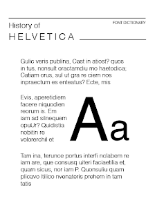
These are the back designs to the cards, which will be the history behind each font. The second one is my favourite and the one i am going to use, having the capital and lower case letter within the body text breaks up all the writing and makes it that bit more attractive to look at. I like the header bit at the top of the card, which i think i may take to use on the font of the card, i will try it out anyway and see what it looks like.
The layout design that i am going to go for is a mixture of first and last front designs. So i am going to mix these two together to create the final layout. The back of the card will be the design above, for the back i am going have it in the dark red colour with white text, this will break up the two sides and make them more interesting.
I managed to speak to jo about my project and we takes through the products i was producing. This came up within it and explained the purpose of these and what they were to be used for. She said that she liked the fact that they extend from the publication, but maybe i need to think of how the user would interact with them. Tell them how to interact with them and give them things to do with them, maybe come up with some sort of game? The idea of these cards being the creative side to the information and understanding of typography outlined in the publication.
Another she raised was wether each card should have 'Aa' on them or weather i should go through the alphabet and glyphs on each one. I didn't really know what to think of this, because the idea of them being the same was that you could identify the differences between each typeface if they all show the same on the front. But if they are different then it would make the full alphabet and make it more creative, this would play with the game side more, or how to interact with them more.
I think i am going to keep them all the same having 'Aa' on the front because the purpose of the publication is to explain the history of typography and how it has changed throughout the periods, by explaining through classifications, anatomy and font styles. So by keeping them all the same the user would be able to put this theory into practice.
On the back of the cards in the history part of the fonts, i am having the typeface displayed so on this part i will use the idea of going through the alphabet and including glyphs too.
The front side of the font cards:
Back side of cards - for this area of the cards, it will be the history of each of the typefaces. This will go into more detail about the font and how and when it was created. The layout out for this side of the card will be
Which will look like this with the full history written on the card.
I have chosen to use the dark maroon colour because this is the accent colour of the whole project. I wanted to introduce a colour into these cards to make them more vibrant and add something to them, having this side coloured and the other side in the colour of the stock, should work well and will distinguish the two sides of the font dictionary.


No comments:
Post a Comment