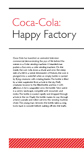
In the publication the images of the campaigns will be printed in it, with the rest of the content, but the information about the campaigns and the theory behind it all will be printed onto a smaller stock, which will act as a tip in on the publication page. This will be printed double sided to hold the two separate sections of text about the campaigns.
The designs above show the inserts, these will be printed onto a pale pink stock to match that of the colour used on the title pages within the publication. This also separates it from the stock of the main publication so you can see it is information about it and something different from the publication.
The design of the insert revolves around the spacing for the information. I wanted the insert to have some design to it but also to leave enough room for the body copy of the insert. The lines at the top separate the title from the rest of the information and make this clear what it is about, the red stripe section at the bottom is more for the aesthetics than anything else, this brings the coke red colour into the design and makes it more interesting to look at. The inserts are structured well and the design is carried across all of them to make them the same and work as a set throughout the publication. These should fit and lay well within the publication.


No comments:
Post a Comment