Thursday, 23 May 2013

OUGD505 // What is Good // Indoor Mapping

The app in which i am going to design for the exhibition is going to based around the idea of way finding and being able to navigate the visitor around the exhibition.

I found an app similar to this which was based on an exhibition space too, here are some screenshots of how it works.

2D map that shows the footprint of the exhibition space. 

A blue dot shows on the map for where about you are within the exhibition. 

When you get close to certain point within the exhibition that have information or things you can view on the app, icons like these above pop up on screen. 

when you click on them it tell you what is there and you can then click on the arrow to find out more. 

Once clicked on the arrow the information is brought up on a new screen. 

An area that has lots of information coming from one point. 

Clicking on one of the icons bring you to a new screen in which the information is displayed for you. 


Selecting the floor of the exhibition is done by the floor selection tool at the side. When you click on the number it opens to show all available floors to view. Simply click the floor number to take you to it. 

I think this is a good way to use the indoor mapping within an exhibition space. This app has been developed well and shows all the different aspects that i would like to include within my app, except i would like to have the app in 3D. This has shown me ways in which i can design the app and make it properly function so that the user can get the most from it and it being useful to use within the exhibition. 


Tuesday, 21 May 2013

OUGD505 // What is Good // Branding

For the branding of my exhibition i want to create a product range like the ones in the image below. I think this is something that is important because it shows how the brand and identity can be spread across a wide range of products, those which are all different formats and ave the branding applied in different ways but when its all together in one place it looks like one set of branding work. 
This is something that i hope to achieve with my own work, i am going to have the branding products, but i may add a few items into the images to show other things such as pens, books, clips just to add to the image to build out this whole idea of what the brand could accumulate to be.  

Love the bright colours within the branding, makes it very eye catching. The pattern and idea of the colours has been spread across the full branding material and adapted for each format. Photography of it all is great too. 


Colours used for the stock and patterns are nice, they all fit together and compliment each other well. Lots of different formats used to show how the logo and identity can be carried across the full branding set. 

Like the tartan style pattern and the colour used. This has a much more professional feel to it by the use of business envelopes and well structured and laid out compliment slip and letterhead. The injection of colour within some of the products bring it all to life and make it a lot more interesting. 

Love the yellow accent colour used. Works well with the grey and black also used within the branding. Again another corporate identity i think as it is very well designed, with everything aligned and laid out to a strict grid. Has a modernist feel towards it. 

Again i like the yellow used within the branding. This has been carried across all the branding material which looks great and makes it stand out because it is so bright. I like the the black pattern printed over the yellow. It also works well against the white stock on the letter head. Nice design to the folder. 

Lovely colour scheme in a pastel colour palette, but one that is quite vibrant at the same time? Logo has been used throughout all the products and looks great. The simple white logo on the coloured product is very simple but still very effective and makes it stand out. 

Love the cut through on the logo within all the products. Makes it something different. Nice coloured stock which looks like there is three different types but they all compliment each other - good way to break down the business products. 

Bright and vibrant pink colour. Not too sure on the pattern used, but it has been adapted for each product well. The photography of this is great and makes the neon pink really stand out of the photo. 

love the green colours used and how it is more environmental and has a recycled feel to it due to the stock. Nice imagery used on the branding material. 

Loving the colour the yellow and grey work well together. The use of the wax stamp makes it very corporate but adds an extra design element within the branding. Looks great. 

Another branding which has taken on the recycled feel by the use of colour and stock. The design of it is really goo also. Photography of it all is great.  


Like the use of different products and material they have used within the branding. The colour works well with the black and really sets it off. The layout of the photography is good also. 

 
Bright yellow works a treat against the metallic black. Design of it all is very well structured and designed to a high standard, looks very professional but has a interesting look to it because of the products used - not corporate but has the design to be corporate? 

The product range of this branding material is great, this shows what you can achieve with branding and how to adapt the logo and identity across a range of products. The products have been laid out well within the photography shoot, which makes it look amazing. 


Nice use of foiling within the branding and makes that area shine within the photography to make it ping out of the photography. Logo has been adapted well throughout all the products. The photography and layout of shoot is great also. 

Another branding that has produced a great range of products which has the identity shown on each product and adapted well for each different format. The layout and photography is also good and they have managed to get the orange really bright and to stand out of the image, catching your eye. 


Using these images i have been able to identify the products which i need to create and have within my branding stationery. I think a diverse product range would be good, but also could be unrealistic with the time limit etc that we have on this brief now. I will still try to achieve something along these lines for my final images of the branding work. 

The same sort of idea will be taken for the rest of the work, especially the promotional work, setting those products out in this sort of layout would be good to show the number of products that i have created for the project.

OUGD505 // What is good // Publication Design

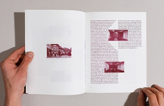
For the publication design i am wanting to have a mix of type and image within the publications. I have created my own grid and working with a 3 column system which i will use across all three publications so that they are all consistent with each other, but here is some inspiration to help me inform myself on the design style that i want to use.  

Good use of imagery within the full bleed image. Black and white imagery works well on here because it gives it that feel of old and tired, which is also tied in with the colour of the stock used. Layout of the spread works well, not too much body copy, images illustrate what the body copy is saying. 

Like the colour of the spread and the minimalistic look to the design. The imagery works well within the body copy and breaks this up a little making it easier to read. 


Although this spread is only body copy and type it is interesting to look at and to read because of the different type and point sizes used within the design. The design i broken down because of the different sizes used. nice colour of stock used too. 

Black and white throughout, this makes it a little boring, could of done with some colour to make it more interesting and to stand out more. Like the type on the left hand side. Not too use on the layout of the right hand side, looks like everything is out of line and not meant to be? not thought out well. 

Good mix of imagery and body copy. Like the use of the green within the imagery and this stands out within the page design. Maybe takes away too much from the body copy? Layout of the page is not standard, but makes it more interesting to look at and to read because of this. 

Good use of full bleed imagery although the title and body copy is hard to read as its in white over a pastel colour so doesnt stand out that well. The page next to it is laid out well within the two columns but could of been more interesting within the design to make it more aesthetically pleasing.

Nice use of splitting the page to be able to use a full bleed image on one half, but the copy on the other page is very boring and there is too much within the given space, with not a lot of white space around it, so this makes it seem as though there is more body copy and hard to read. 

Love the colour used throughout the spread. The colour overlay works well on the imagery and makes the page more interesting and brighter to look at because of the colour. Body copy works well over the coloured page. 

Great use of image and text together in the layout. The body copy is broken down by the use of the images and makes it easier to read and has less body copy because of the images. Titles and heading are placed well and in larger point sizes so easy to identify and read. 

Great use of columns and grid within the page, this makes the design and readability of the page a lot better. The structure also helps you read through the body copy and makes it seem there is less body copy within the page itself. 

Nice use of colour within the heading of the page. This is continued throughout the page design and used to break up the body copy within the page layout. The colour makes it more interesting and adds extra brightness to the page to make it less boring. 

I like the 3 column structure used within the design and as it shows here it can be adapted to work for the different content on each page. Use of the bigger heading within the body copy work well and breaks up the page which would normally be heavy on body copy. Use of line separators and the heading of the page works well together.  

These images show a good balance of type and image within the layout, there is a clear grid structure which provides a good, clear and legible layout within the publications. This sort of style it they way in which i am going to design my publications, but as i said before i have my own grid and using the 3 column system so the design will take on its own aesthetics as i dont want to copy something that is already out there and being done. 

OUGD505 // What is Good // Posters

For the posters within the promotional material i want to create a range of them, these will be slightly different in how they are designed but all advertise and promote the museum. I think having a range is better than just one because this gives variety and not everyone likes the same aesthetics so its giving everyone a chance to be attracted to the exhibition and come along for the right reasons. 

For the posters i want to mix the use of imagery and colour and type, by layering these items up together and creating some clean and simple posters which effectively promote and communicate the exhibition. 


I like the use of the colour within all the designs. The way in which the posters have been hung and displayed makes it more interesting to look at too, along with the different sized formats of each one. The mix of image color and type has been used within some of posters on here and it looks really strong, i particularly like the one with the yellow face, this looks good with the black type over the top. 

With this design i like the use of the type and image together, the type gives it an oriental feel to the design and works well against the image. The same with the bright purple / pink colour which is used within the design, this makes part of it stand out from the rest and in general creates an interesting design.

This product is a information poster which folds down to create a publication sized document. I like the layout of this document and how the black and white photography has been used - this both contrasts with the bright green type colour and also flattens all the images to the one colour so none are more prominent than any others. 

This is set of branding products, you can see here that the design aesthetics and any imagery and type has been used across all products within the range. This creates a consistent body of work, which clearly shows the application of the branding aesthetics across a range of material.


The use of the type and image works great together. I like how the type has been set out especially the main title at the top, but also that the body copy as been set into columns which make it seem like a editorial piece. The image has been changed to take on the blue colour which compliments the red of the body copy but is also a lighter colour so this sits into the background more. I think this has been laid out well and shows a good composition of all elements within the design.  

The layout od the type on this poster is great, the bottom section has had a lot of time taken to line up every element of the type and make it all aligned to each other. The use of the white and red over the image is strong and bold and works well with the black and white image.   

I love the layout of the type on this poster. I think its very interesting to read and sends your eyes around the full poster area, so you take in every bit of the design. The type has also been set around the top left image, which works great and doesnt really take any focus off the image itself. I like how the smaller body copy has been over laid on the larger type too. 

Great colour scheme and how it works with the black and white imagery. I like the idea of having the circles and how they work within the design and with each section of the image. This splits the image down into three areas and highlight different part sof it which you probably would see otherwise. The lines in the background also set how the smaller body copy is worked into the design. 

This is very image based and uses a lot of block colour and gradients within the design. I think the type is quite hard to read within it because this is either really small in the case of the body copy or the title is too hard to read because it is in white but against a pastel red which doesn't make it stand out that well really. I like the overall design and how the different block of colour and image have been brought together, but i don't think the type has been designed or thought about that well. 

These examples show the use of image and type together in one design. The composition of the two together is important to make the design work and so it communicates the right message to anyone who looks at it. The colour and how it is applied to the artwork is also important. I defiantly need to know the information to communicate on these posters before i start to design them and select the correct imagery which will work on the formats that i will use. 

I am interesting in the tall and thinner paper size that some of the posters use within this post. I think working on a different format like that will make it more interesting, especially for me as i dont particularly enjoy designing posters. 

Using this imagery and ideas from these posters can help me in making the decision on my own poster for my exhibition. I have been informed on a style in which i like and think would work not only for the poster but to run throughout all the  products. The use of imagery and blending modes and colour, these three when mixed together right and with a few other elements can make the best result in the artwork, which is what i am aiming for. 


OUGD505 // What is Good // Invitations

For the invitations that i want to create for the opening night of the exhibition I want them to be something special. They should be personalised and show high quality, so i think i am going to do something which involves me printing them, maybe embossing them would be nice. I like the idea of the rectangular shaped invites. 
Here are some examples of invites which i could use as inspiration. 

I like the format of these invites and the mix of photography with the solid colour and type. 

This is an interesting way in which to design the invite by using a laser cutter to create the artwork. Im not sure this has the aesthetic i am after for my own invites but i like process and how it has been adapted for this invite. 

Great use of colour against the stock colour and having a range of colours could create a personalised range of invites. I like how the back and front design connect by using the circle outline. 


Very good standard of design, I think foiling has been used on here and it looks very attractive to look at. The design is simple but catches your eye with the solid gold and the slight shine it has to it. It looks very upper class and an elegant event. 

I like the composition of these invites. The use of the imagery and the placement of the type within these are very well balanced but at the same time different from what you would normally see. Its great and i like it. Im not quite sure if this would work for my invites. 


Love the gradient around the edges of the invites - this ties in nicely with my own exhibition branding and could be good if i could do something like this - i think more research would need to be taken out to see how i could achieve this


Love the folding format of these invites, its interactive for the user and gets them involved straight away. The design is good as well i like that its all type. Good use of colour and stock too. 
 
I like the format of this invite. The rectangular shape but folded up into three smaller rectangles. This could be good for posting out as it would be small and cheap to post but yet the design could be great because it folds out to reveal a good standard sized invite. 

Love the colour in this. 

To me these look more like programmes, but maybe they are large invites with extra information about the exhibition in. I like the design of them the colour choice is great, especially against the grey stock. I like these but dont think its suitable for my own work. 

Looking at this small selection of invites along with other promotional material has informed me about my own practice and the project in which this falls into. I think i will take forward the idea of using the rectangular format, but i want to use some printing techniques within this to make it more personalised but also give it that hand made feel too.