Wednesday, 27 February 2013

OUGD503 // Ella's Kitchen // Editorial Design

My task within our partnership was to look into editorial design for our project and how to design it to fit in with the product range.
The publication is to communicate the brand, after breaking this down into 4 elements, I need to look into publications we can work around these 4 elements / break it down to 4 separate books. I have started to look into multi format documents, by this I mean one publication that is broken down into 4 different books, each with a different format, but can be binding / held together to present as one document.


Looking at these publications and ways of creating a variety of publication formats together to create one, has given me lots of ideas for what i could create. 

I think this is the definite route to go down, as i think it will break the brand down into manageable chunks, with it being like this, it is more likely that the user will actually read through each section and take notice of it. 

This has shown that there are a wide variety of these documents out there and i need to look at ways in which they could be bound together, along with the format of each smaller book. Deciding on the content for each booklet should be the next step so i can decide what format will suit it the best. 

OUGD503 // Ella's Kitchen // Character Design

For the creative partners brief, me and greg have decided to do the Ellas kitchen brief, from this i came up with a concept to run through our products, which is to use the ingredients of the drinks and characterise them to tell the story of Ellas kitchen brand.

The brand are very aware of the ingredients and being organic and good the environment and the world, as this is a big importance to them, highlighting this throughout the branding of the products seems a good way to portray this to the clients and shareholders of company.

I have started to look into character design, in particular fruit characters. To start with i have looked generally at illustrations of fruit; looking mainly at fruit drinks as I thought this would provide the most visuals for this idea, from that i have looked at characterising fruit so we can use them through the products.


After looking at fruit character design, I came across the brand nuts.com, which use characters of nuts within their packaging, I really like the hand drawn fun style of the illustrations and of the whole branding of the packaging in general, so i have looked at more of the products. 


Hopefully this will start generating some ideas for the characters to go with this concept for the brief.

Monday, 25 February 2013

OUGD505 // What is good // Exhibition Branding

After looking into exhibition promotion, I wanted to look more closely into the branding of an exhibition and how this works over a range of different products and applications. I have found certain projects which show the branding over many products, but that are applied with thought and the whole idea of the branding is a concept to run over the products.


This branding is for exhibition on picasso and modern art, it was designed by Effektive Design studio in Glasgow. I like this branding because it has been adapted across lots of different products and applied to each one in a different way. The colour scheme of the branding is also nice and bright and airy which compliments the idea of the exhibition.


Another product by Effektive Design Studio, this is a publication which displays a number of exhibitions at a museum. I like the colour scheme used throughout, the orange against the black and white photography works really well and the orange stands out, this could be useful to think of in my own work. The format of the publication is good too, being able to rip out each page is great idea for publicising a exhibition. I think i could use this product within my exhibition to maybe be the guide?


Again another branding that is used across a range of products. This again is for a exhibition called cross over. I like how the branding is used over all the products, but each one is completely different. I really like the publication front cover, the concept of this is great having the cut out cross etc with the second stock below. The colour scheme is kept consistent throughout and the print colour and stock colour is very close to each other too, which makes it look more professional.


With this i really like the idea of the turned over corner, it can be used over all the products and be something that stands out and is different to other things. The pattern used on the underneath cover is nice and brings all the branding to life. The colour scheme is great and works over all products.


This isn't so much about the branding, but showing how the brand has come around, showing from the very first sketches through the digital process to get the final posters for an exhibition.


This is my favourite out of all of the ones i have shown, I dont particularly like the design of it, but how it has been executed to work across the different products is great. I think the product range for the promotion of the exhibition has been over exhausted and done to a great standard. The design of each individual product has the same concept and communicates the identity of the exhibition but yet each one is different. All the products are ones which would be seen in the public and be something that would attract people attention. I defiantly think i can use some of these ideas and products in promoting my idea.

OUGD505 // What is good // BBC Equipment

Another section of the history of the BBC Radio comes down to the equipment that has been developed over the years and how this has influenced the radio in itself. The idea of this can link into the project and the exhibition by having a section of it on the equipment.

1932 broadcasting house

When Broadcasting House, London entered service in 1932 the BBC published a book of photographs of the building called "Broadcasting House". Its pictures give us not only a view of the studios and other technical areas but also of many other parts of the building. A corridor, a staircase, a dressing room, the boiler room and the ventilation plant were all considered worth recording just as much as the Control Room, the Concert Hall or the Chapel Studio (3E).

In addition to this volume, a further book ("A Technical Description of Broadcasting House") detailed various technical aspects of the new building. From this we can attempt to work out just how the broadcasting system worked from microphones to the lines to the transmitters.

These books can still be found in second-hand bookshops and are well worth seeking out, though the technical one can be hard to find. So this site is an attempt to make their content more easily accessible.

In these web pages you can find most of the photos from the books together with some extra photos from the 1930s. The first volume worked through the building floor by floor and a similar arrangement has been used here. Each link to a 'floor' will open a page featuring a simplified floor plan and the menu to the left of the screen will offer one or more extra pages featuring the photos of the various areas on that floor. You can also navigate by clicking on the grey areas of the floor plans. The amount of technical information on these pages has been kept to a minimum.


For more detailed information about the studios and the Control Room, refer to the final 'Technical' section. Here you will find several diagrams reconstructed from the originals in the technical book and notes describing the broadcast chain in detail. My thanks to Barry Taylor for his significant contribution to this section.

Most of what appears on these pages had gone by the end of the twentieth century. The building underwent a major reconstruction in the early years of the twenty-first, being officially re-opened by the Queen in April 2006.


Belfast Control Room in 1930's
The Control Room was equipped with two rows of bays, one on the left of the main desk with line termination and test equipment and the other row (right) to the right of the desk. This was made up of about eight bays, some "standard" bays, some made of angle iron. The fuse bay consisted of a sheet of metal fixed between two other bays and containing fuses for all the Control Room equipment. Much of the wiring was taken direct to the jackfields, etc, without going via mounted terminal blocks. During the summer of 1936 this row of bays was replaced by standard equipment occupying the same position.

This work was made particularly difficult because there was only about 18" between the rear of the equipment and the wall of the Control Room. This was not really sufficient space in which a wireman could work. In addition, the amplifiers and jackfields were in constant use for live programmes. Bays carrying live programmes had to be removed from the plinth and leant against the back wall to allow new bays to be erected on the plinth.


The Blattnerphone
An essential requirement of a recording system for broadcasting is that it should be possible to playback as soon as possible after making a recording. When broadcasting began the manufacture of gramophone records was a well established industry, but the process involved in making a record took at least twelve hours. It wasn't until 1930 that a tape recording system suitable for broadcast use was available.

As early as 1900 the Danish engineer Valdemar Poulsen (1869-1942) was demonstrating his Telegraphone at the Paris Universal Exhibition. This machine magnetically recorded telegraphy transmissions on a steel wire. In 1924 Dr. Kurt Stille (1873-1957), a German engineer, developed a practical office dictating machine which was produced by the Vox Gramophone Company. This, too, recorded onto steel wire but the quality fell far short of broadcast standards. The BBC became aware of this machine and closely followed developments in magnetic recording. Its interest increased with the coming of the Empire Service, where the same programme would be repeated several times for different time zones.

Film producer and showman Louis Blattner (1881-1935), a German who lived in England, formed a company to develop and market Stille's inventions. Among the projects that he set his engineers was to produce a machine which he hoped could be used as a source of sound synchronised to film.

In September 1930 a machine was installed for trials at Avenue House, then the home of the BBC's Research Department and the results were deemed good enough for speech, but not for music. The BBC negotiated a five-year rental agreement with the British Blattnerphone Company in January 1931 at £500 for the first year, £1000 per year thereafter, plus £250 for each additional machine.


In May 1931 the Blattnerphone was moved to Savoy Hill (right) and entered service. In March the following year it was moved again, this time to the newly constructed Broadcasting House where it was installed on the seventh floor. A second machine soon joined it, allowing recordings of any length to be made by switching between the two recorders. These first machines were made in Germany. They recorded onto 6mm wide steel tape which ran at 5ft/sec. A full spool weighing 21lbs contained just over a mile of tape giving a recording time of twenty minutes. The speed of the D.C. motor had to be controlled by watching a stroboscope attached to the capstan and operating a sliding rheostat. The machines soon proved to be mechanically unreliable. In September 1932 a third machine was installed at BH. Again of German manufacture it used 3mm wide tape which came on spools allowing 32 minutes recording time. The drive was by an A.C. motor. With careful adjustment this machine gave better results than its predecessors, but still suffered from uneven tape speed. 

At the end of 1932 a programme called "Pieces of Tape" was produced in the Blattnerphone room, being a compilation of several tapes recorded that year. However, the mechanics of the editing process were too laborious for regular productions using the technique.

The following February a second 3mm machine arrived. Designed (by von Heising of the British Blattnerphone Company) and built in England it was bench mounted and used two A.C. motors, one for the tape drive and the other for the spools. Although it was better engineered and more reliable than the other machines it was mechanically noisy and had worse speed constancy than the original machine.

By now the original 6mm machines were being used only for transferring the recordings they had made to discs. The 3mm machines required considerable maintenance effort to keep them working, and this had an impact on the number of bookings that could be fulfilled. When the Marconi Company bought the Blattnerphone rights in March 1933 they offered to sell the BBC the four rented machines. The Corporation wanted British Blattnerphone to replace all four with a new improved design from Marconi as soon as possible. In the meantime it hired three machines of the von Heising design which were installed by January 1934.


These machines had five heads on the central pillar - spare record and play heads had been added allowing immediate change-over should one of the heads fail. This seems to have been done at the suggestion of BBC engineer R. C. (Reggie) Patrick, then working for Research Department, who was installing the BBC machines. When an edit damaged the pole pieces the other head was brought into contact with the tape and the damaged head's pole pieces were replaced.


The two motors were of similar type. The left one, via gearing and a friction clutch, drove the left spool and, via a V-section belt and similar clutch, the right one too. The clutches were adjusted so that the tape was just in tension and when the main tape drive was applied the tape would unwind from one spool and take up on the other.


The second motor was connected through a worm gear and flexible coupling to drive a flywheel, which was rigidly coupled to the 'driving wheel', or capstan. The motion of the driving wheel was transmitted to the tape by a moving canvas friction belt which ran round four jockey pulleys (one of which was adjustable) and also passed below the driving wheel.

During 1934 it was clear that recording was outgrowing its space in BH and in November the three Marconi Blattners and the first von Heising machine were moved to Maida Vale. By this time twenty tapes a week were being recorded for the Empire Service, keeping the machines busy for up to seventeen hours a day. The arrival of the Marconi-Stille machines (see next page) during 1935 allowed the Blattners to be taken out of service and returned to the manufacturer, though one was retained for research purposes. In September 1939 this machine was hurriedly sent up to Wood Norton in Worcestershire, which was about to become the temporary home of several production departments. 
Related page
L.G. Smith mentions Reggie Patrick at Wood Norton and the installation there of a Blattnerphone machine.
Reggie Patrick managed to get the machine working in time to make a recording of Prime Minister Neville Chamberlain's speech declaring war on Germany.


OUGD505 // What is good // Exhibition Promotion

After deciding that i am going to use the exhibition title as my idea for the brief, I have started to look into exhibition promotional print colateral. Here i have looked a range of products which will all be linked with the idea of exhibition promo. These are items such as posters, invites, brochures, website, packaging, gifts etc. These all make the event look like a fully thought out design idea and all are a way to brand the exhibition. 

With this design i like the colours used within the branding, the logo is very strong and stands out well within the design of the branding material. 

I like the format of this invitation, the printed front side looks good when you first pull it out of the envelope. The envelope net is also a good choice. 

The yellow and black work well together here and make it vibrant, which makes it stand out alot. The colour has been carried throughout the publication to tie it all together, again this works well with the body copy being printed in black over the top. 


The new nordic, i like the colours being used within the branding, they compliment each other very well, also working with the white and the grey background colour. 

This flyer / invitation is great. I love the illustration within it and the bold orange colour used throughout. The type works well too. This is all considerations that i need to think abut when doing this for myself. 

This shows a great product range within the branding. The shapes are shown across the different products and the ranges of them too. I like the vibrant colours used within it all and think that the shapes create good visuals for the book. 

This black and white imagery within the poster works really well and brings out good definition within the photograph. Personally i think it would have been good to have a coloured background. But this gives me good ideas for using the black and white imagery within my own work. 


These two images show the content of a envelope and designed information within it. I think this is some sort of mail out. The colours used in the top image for the background of the information, fit together well and work as a set of palette colours. This also breaks down relavent information into different categories. 
The envelope is in keeping by the colour of the corresponding the information sheet and the net of this envelope looks good too, it doesn't look like a box standard envelope from the shelf. 

web presence - the use of the orange within this and overlaying the photos makes it more interesting to look at. I like the grid format that the web page is in. 


Interesting packaging, which has the information needed to communicate to the user but then also hold the disc etc that te packaging is holding. This makes the packaging hold everything in once place and be sent out in an interesting format which makes it interactive for the user. 


These images above are all part of the same branding. Again you can see here how it has been applied across the range of products, but still looks the same nonetheless. I think this is something that i need to keep in mind and make sure that i am working with the brand identity but applying if accordingly to the format and size of each product. The use fo the imagery and overlaying colour works well and is something which i think could with my concept and work.


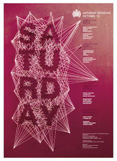
Another set of images which show a range of posters. I think this is really interesting, the use of the string to create the words looks really effective on the poster and catches your eye when you first look at it. The colour used for the designs are very bold and deep colours. 


This set of 3 type based designs are all part of a bigger set of designs. I picked these three out because they were the ones which caught my eye the most. I think the composition of them is great and the use of the type within the posters is used well to make you look around the whole area and see every bit of it. With the ones that incorporate image within the design, the type is built around this and made as though it is coming from the image. 


I like this for the format of the design. I think this is interesting in how it is folded up how the type is arranged within the design to make it readable as you open the folded sheet. 

The arrangement of this branding looks great, this is also something that i need to think about when i am photographing my work. The design of the work is interesting an looks goo with the colour choice. The stock used works well against the design and colours that are incorporated within it. 

Good installation material or something that could be adapted for a way finding system within the exhibition space. I like the idea of this and the layout of it the type within the shape. 


Sunday, 24 February 2013

OUGD505 // What is good // BBC Radio Branding


1Xtra DJs and show Branding
BBC RADIO 1XTRA

As part of our ongoing relationship with BBC 1Xtra we've recently revised the whole look and feel for the station. Aiming to create something more confident, slick and simple, we've produced a stripped-back scheme which focuses on big, bold type and loud colours.


We've also reworked the iconic 'bass pulse' to form a vibrant backdrop to the new, more engaging presenter photography.

Finally, to work alongside this we've developed a flexible messaging system that can be used across all genres and events and introduces a more conversational copy style – all set in our new custom 'Xtra Bold' cut of the brand font.

Studio Output are the design company which have done this branding.
http://www.studio-output.com


The same company also did the BBC Hackney 2012 Big Weekend branding.

Having worked on Radio 1's Big Weekend over the past few years, we were excited to learn that the London 2012 warm-up event, Hackney Weekend, would be the biggest yet, with 100,000 revellers attending over the two days.

Showcasing UK and international artists alongside up & coming talent, the event also launched BBC Radio 1 and 1Xtra's Academy; a series of masterclasses and workshops throughout June offering advice to young people from Hackney and East London. 

We began the branding process by devising a flexible logo lockup that would translate across various platforms and formats while showcasing the BBC network brands involved. The first implementation was a microsite to launch the event, and this styling was applied across the event materials – from security ticketing to eflyers and posters through to merchandise.

Working closely with the BBC and their production team, we executed the look & feel across onsite graphics, including the imposing main stage standing proud at 17m tall, 48-sheet posters, signage and wayfinding and some special over-sized onsite 3D graphics.


Also the BBC Fringe festival branding was done by the same company.

The BBC has a strong connection with the Edinburgh Festival Fringe, broadcasting across different network channels from venues all over the city. In 2011, for the first time, the output was consolidated into one venue, giving a greater focus to the corporation's presence. Having worked with event teams across the radio channels, we were invited to create the visual identity, extending this into a graphic scheme which could dress the site.

It was important for the branding not to appear 'owned' by any single station or channel, but to feel at home across all of them. Our solution is loosely inspired by the satirical comedy formats of the 1960s, and reflects the spoken word output of the venue without being overly 'comedic'. The condensed, hand-drawn letterforms have a practical function and allowed us to create something unique with only a few elements.

We designed the event branding and site guides, and worked with the BBC web team to deliver a microsite. Along with the visual work, we named the venue 'The Bubble', resulting in the café venue being called 'The Baby Bubble'.


The radio 1 website was also designed by these too:

BBC Radio 1 launched its new website in November 2009 following a year of careful restructuring and redesign, led creatively by Studio Output and built by Collective. Using a bold photographic route for each page’s background, we designed a series of mini sets for the station, representing each show and its presenters. The work started with the design of new logos for every show; as with the photography, we combined consistency with individuality, creating a set of different logos all based around the BBC Radio 1 typeface, Century Gothic. 

The overall look and feel is a result of a year-long collaboration between Studio Output and artist & photographer Richard Paul. The outcome is a statement-making, vibrant site that is bursting with personality, a design that perfectly complements Collective’s brief to build a site that is more accessible and exciting for its users. Visit bbc.co.uk/radio1/djs.


BBC Blast was another BBC event that this company has designed for - 
BBC Blast is designed for 13-19 year olds, inspiring them to feel confident and get creative. From April to November 2009, the Blast Tour travelled all over the UK, offering young people free creative workshops and covering all areas of art & design, music & audio, dance, drama, film and fashion. 

Using Blast’s Fallon-designed branding, we developed graphic panels which would feature across printed material and on-site merchandise, as well as branding all the vehicles, banners and tents used on the tour. To communicate the creativity of Blast we recreated the movement created in brand animations, bringing that energy to life on 2D surfaces.


The final event that the company has worked on for the BBC was the teen awards