DK Eyewitness Travel Guide Australia
Australia: Country Guide (Lonely Planet Country Guides)
The rough guide to East Coast Australia
Australia Pocket guide
Offbeat Australia
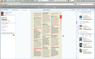
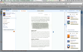
From looking inside these guides i can see that there is lots and lots of text. Some pages have image and text aswell, but the majority is all text, this is something i want to get rid of. I want to still display the same amount of text and have the same relevant information as these guides but do it in a way so there isnt as much text on a page, because i think thats what puts people off travel guides.
On a positive note all the guides include a map of the area, all have tourist attractions - most have a top… for the area and all use colours within a colour range.
The colours i have seen in these guides are green and red. I am wanting to base my guides around green, so that it ties in with the Australian colours, so this works out well. I am going to include tourist attractions and maps too just like all these do, but the way in which i display them will be more designed and thought out more, the layouts will be more organised and create a cleaner crisper look to the guide, hopefully so that more people will read them.
Out of these guides here i like the lonely planet one the best, they use the space within the page well, the pages arent all crowded with text and use image and type well together. The colour scheme within the book is good too.


No comments:
Post a Comment