Wednesday, 28 September 2011

5 graphic designs i love


I love this design because it is using different materials, its made out of wood which is laser cut to make the design in it, then a coloured piece of perspect is put behind it to make the colours come through. I love this because its more of a traditional design; not all on photoshop. I like things like this, not rely on a computer to make a good design, i think this is more than a good design its excellent, i hope to do work like this.


Again i like this design because its a traditional technique, its done using screen printing. I love the effect screen printing gives a design, the imperfections that the design has especially the edges and the fact that each print will be different in some way.


I love this because of the typography, lots of different type has been used in this one design but they all work well together and compliment each other. I like each typeface used within it and think it lookes really good.


I love this, i love anything letter press/woodblock work. I love the effect that it gives and everything about it. They way the process is done, the outcomes it gives, with each print being different and all the little imperfections you get on each letter. Its completely different from digital work and you wouldnt be able to get the same results trying to copy it on photoshop.

I love Tim Marrs' work, any of his work i like. I like how he uses photos, hand drawings, textures, paint, symbols, illustrations all together and layers them up to make the design. But when you look at the design in detail there is an underlaying story to it that makes it even better. Each time you look at one of his designs, you notice something new or interpret it in a different way.


Tuesday, 27 September 2011

Alphabet Soup

For this brief i was the word 'expand' to do my 10 letters on.
To get me started i looked through various websites at typography which i thought was to do with expand, size, scale etc.


All these designs are in some way expanded. Either the letter itself has been expanded within a given space or there is multiple letters making the type expand. Some of these examples have given me ideas for my 10 letters.

Friday, 23 September 2011

iphone screensavers

As part of the designs for the iPhone screen savers we needed the background of an iPhone for this i used my phone and took the photo.


Thursday, 22 September 2011

Timetable Research

Kate researched into the college timetable, so we know what days and times students would be in college, we can also plan other things around these times once known:


For the 'How to' research I looked into the college timetable so we could fit our app around the Graphic Design BA first year timetable. This was obviously an important factor as the app had to coincide with our timetable.  I found the dates that run through out the year and a weekly timetable.


12th september-  Induction programme- Enrolment and introductory briefings


19th september - 24th october: first semester 
OUGD401 Brief-Part 1
OUGD402 Brief-Part 1
OUGD403 Briefing
OUGD404 Briefing
24th October-31st October TUTORIAL/ RESEARCH VISITS WEEK
31st October- 19th December:
OUGD405 Briefing
19th December - 2nd January CHRISTMAS HOLIDAYS
2nd January- 13th February:
Submit part 1
13th February- 20th February RESEARCH VISITS WEEK
20th February - 2nd April:
Brief- Part 2
OUGD406 Briefing
2nd April- 16th April EASTER HOLIDAYS
Submit part 2
30th May
OUPD101 PPD1 PRESENTATIONS (assessed)
ASSESSMENT and show preparation
18th June: END OF YEAR SHOWS
ACADEMIC YEAR ENDS 22/06/12


Weekly timetable:
Monday 9:30 - 4:00
Tuesday 9:30 - 4:00
Wednesday: Studio Development
Thursday 9:30 - 4:00 (evening introductory classes for things like photography will also take place on thursdays)
Friday 9:30 - 4:00
Saturday: Studio open from 10:00 - 4:00

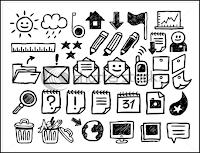
Phone Icons

Sophia researched into phone icons, so we could see what type of icons to design for the pop up element of the app.


I like the idea of these icons looking hand drawn


I think these icons look really good, but the colour used makes them look very serious and professional.


These look like typical smartphone icons.


I like the detail behind these icons, but the cartoon style in which they’ve been created is a bit childlike. For icons that need to be bigger on the calendar app, I think detail is quite important without being overly intricate.


These icons are not as effective, but I was really attracted to the little pentil and paint brush, that could be a symbol for allocated time to be creative.


These are examples of iPhone app symbols. There are ones that I think are really effective in the context of our idea like the little slice of pizza could be a symbol for having a takeaway and the speakers could be a symbol for a houseparty.


The shopping trolley on this works well and would work well as a symbol for going food shopping, something that every student needs to do.


App icon Research

For designing the App icon for our project i looked at existing apps on the itunes store and how the icons were designed on there.
I found that the majority were really simple as the icon is so small, there is a distinctive image/symbol on it which is relevant to the app and most use a variety of colours to stand out.

Wednesday, 21 September 2011

Interview Techniques

Famous interviews


Information taken from wikipedia

Calendar Layouts

In our group we split up the research so everyone had something to research each.
Emily researched into calendar layouts:


The idea of possibly having a typically doodled student diary was something that came to mind during the research and the image below is a good example of this


The group generally liked the simplicity of the above layout of this weekly diary and so I'm going to use the basic ideas taken from this format to inspire my own design when creating a diary/calendar

Tuesday, 20 September 2011

Voice Recording

As part of our app we are wanting to have a voice recording of the tutors.
I have found an app which is similar in that you can set a voice recoding to a date to alert you.


VoCal
The original, best and most trusted personal reminder app available. Your reminders, in your voice, in your words, delivered on time, every time. Speak, don't type.


Existing iPhone apps

1. Classes - Timetable
Classes is a smart timetable for school and university. Immediately after starting the app, the next class is displayed with all relevant information. On rotating the device, you are presented with the complete timetable in landscape mode. Classes shows all the information you need when you need it.


2. SchoolBook
SchoolBook puts your plain old high school timetable onto your iPhone and iPod touch. It tells you what classes you have and thats it; its the ultimate no-frills approach to a digital timetable.


3. iPlanLessons
Lesson planning for home schoolers


4. Calendar+
Scroll seamlessly through your events on your iPhone, iPod Touch or iPad. Calendar+ gives you a fantastic overview of your events and a quick nudge up or down will move you instantly and seamlessly - no more waiting for the next week or month to 'load'.


5.  CalenGoo
CalenGoo gives you a fast and easy way to access and modify you Google Calendar with your iPhone, iPod Touch or iPad. It can also be used when you have no internet connection, using the cached data. Changes are saved and uploaded the next time you are connected.


6. This is note
This is note is different from other notes - it is a 4+1 types in one. You can select one among the four themes of Note, Album, Diary, To-Do and Calendar. Then you can complete your style of note by choosing from various designs of note covers, fonts and stickers.


7. SaiSuke
SaiSuke has various view models allowing you to see your calendars in a daily, weekly, or yearly views. You can get a perspective schedule for the month using the monthe view, which allows you to see appointment titles in a monthly styled calendar.


8. miCal
miCal is the missing calendar for your iPhone and iPod touch. With miCal, planning your events will be much more efficient, well-arranged and even more beautiful.


information taken from apple app store